Order flow & Footprint Series #1
A little bird told me you want to learn Order flow, Anon.
That's good, Order flow much alpha. Especially when paired with Market Profile.
However, you need to take a walk outside of your comfort zone. It's cold and dark out there. The journey to the exotic, tropical alpha is full of peril.
I think the best point to start is the tools. Worry not, I prepared a full toolkit for you.
1. Tools
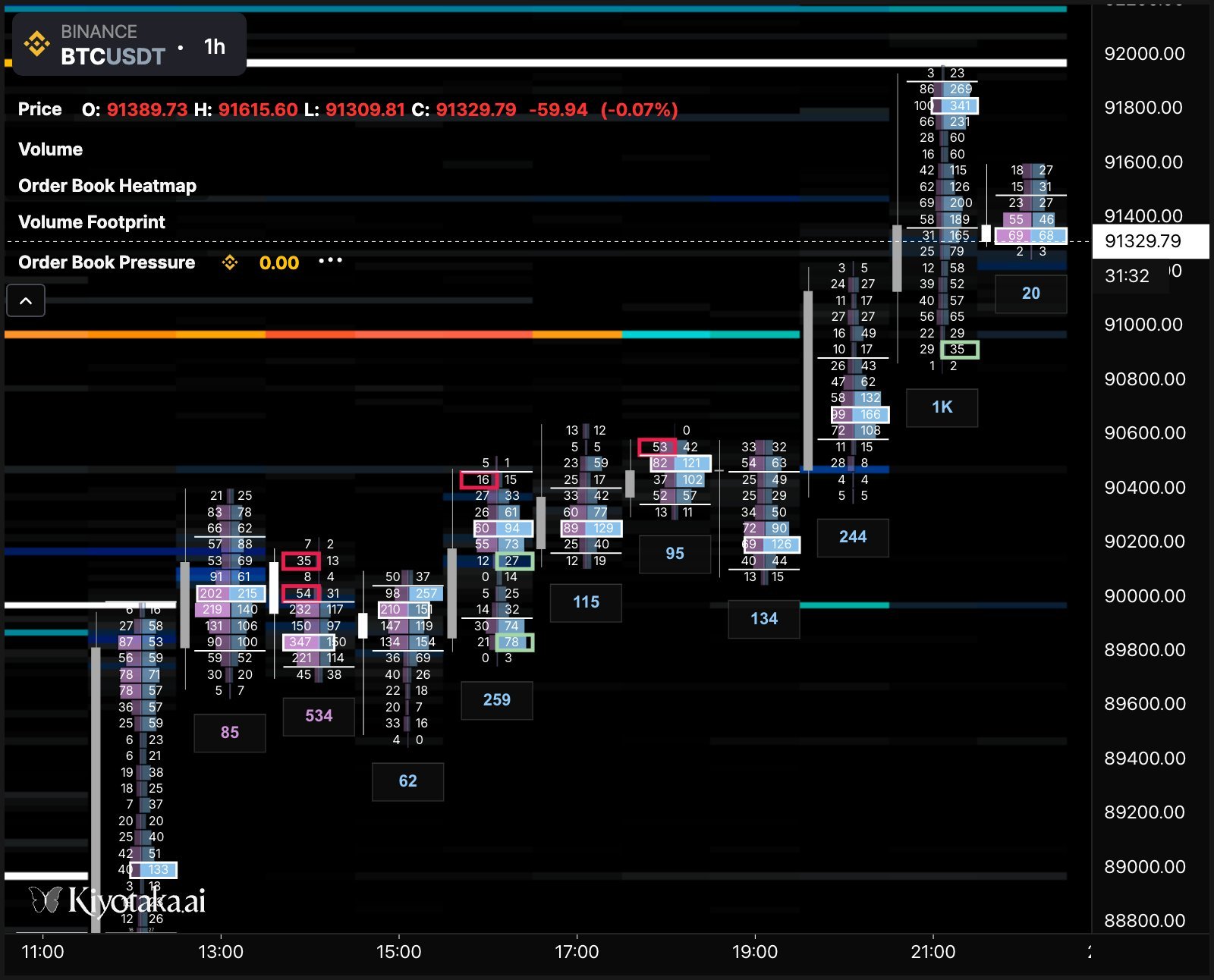
Order flow is - you guessed - based on ORDERS. The whole market is just orders, and that's what provides liquidity. You need tools to read what's going on with the orders. So let's have a look at those flashy things on the screen.
I don't use red and green on the charts because
a) they make neurons fire for no reason (traffic lights conditioned us), so I use inoffensive colors like purple, blue, black, white and grey.
second) red and green are pretty confusing when trading the footprint and order book together, for reasons you will understand in the next few paragraphs. I recommend using your own palette, but you do you.
3) it's not always consistent across different indicators - see what I did with the numbering of this list, that's how it feels to me. The terminal colors are fine btw, just in the charts I prefer other colors.
Order book.
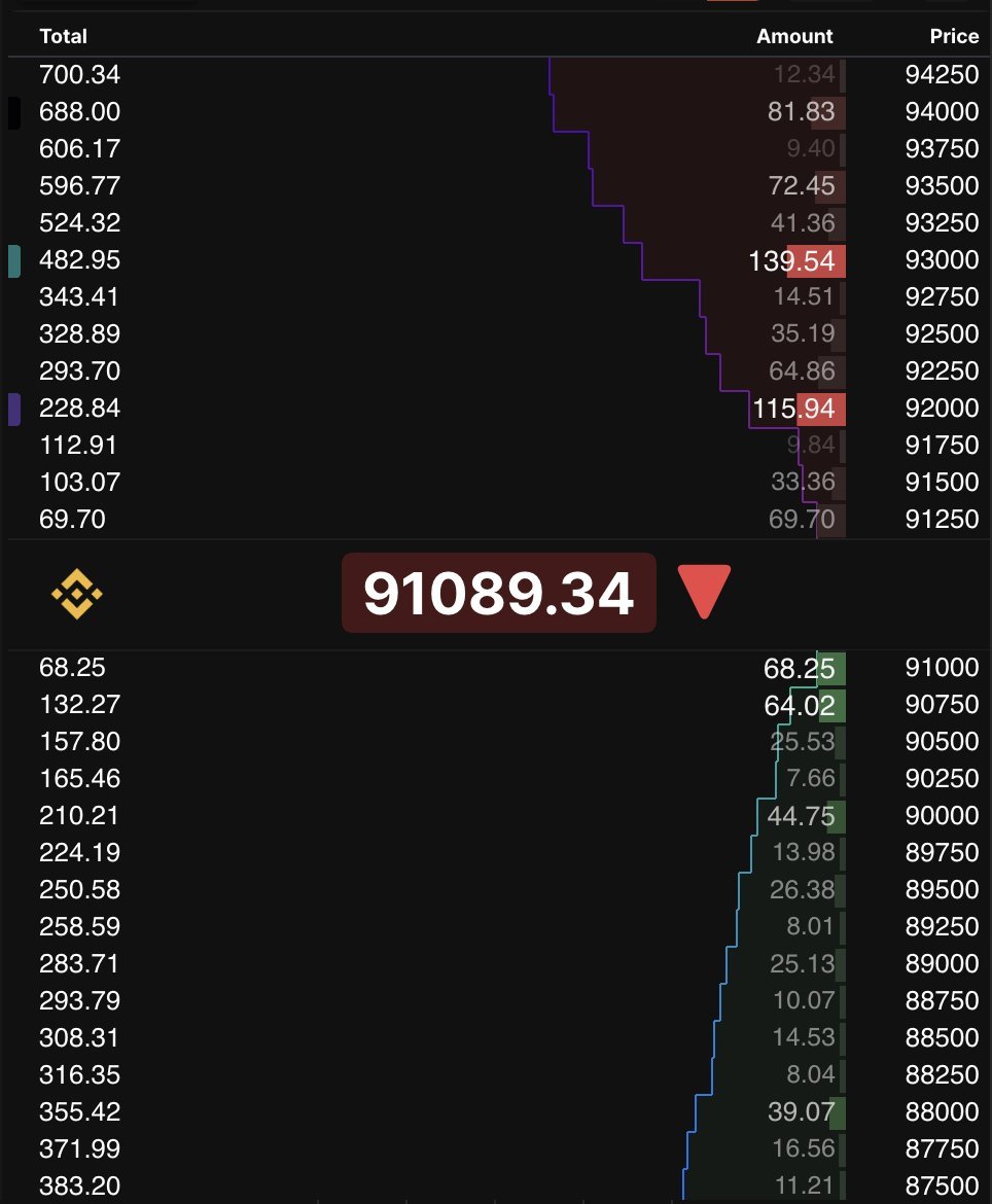
An order book is the "list" of all limit orders booked. Mind-blowing definition.
The middle line is where the trades are at, the last price. The big ass arrow tells you is the last pip was above or below the current price. Red, it was above. Vice versa for green.
The lower half is the buy orders, and the upper half is the sell orders.
Moving from the center, the first line of the green side is the highest bid, and the first line of the red side is the lowest ask. If you place a market buy order, you buy into the ask, if you place a market sell order, you sell into the bids.
The leftmost column is the total value (in this case the denominator is BTC, but you can choose dollarones as well) of orders, stacked. It means each level sums the current level with the previous.
The column inside the colored (can we still say colored?) area is the value of orders per price level (tick size grouped). The width of the colored band is a visualization. A buy/sell wall will stick out a lot there. This type of tool is what we call Depth Of Market (DOM). Think of the sea. You can see how deep the water (liquidity) is.
The rightmost column is the price levels (tick size grouped). In this case, the tick size is 250 (dollars).
LISTEN WELL: When the price moves UP, there will be new bids formed below the last price. Vice versa, when the price moves DOWN, there will be new asks formed above the last price. There's (almost) always liquidity to fill the price movement.
Please internalize this, you will need it for the next tool.
Turn the volume on in the settings and try to listen to the orderbook printing. Why is this a useful exercise? Because we trade in front of a screen and not on the trading floor anymore. Adjust the order size for sensitivity. Try to use more senses to read the flow of orders, so when you use your eyes only, you know what's happening. Those are BID AND ASKS going on.
Le floor tradoor.
The footprint.
Ahh, I'm sure you were waiting for this.
So let me start by saying that I really wanted to dumb down the explanation, and I think I found a way.
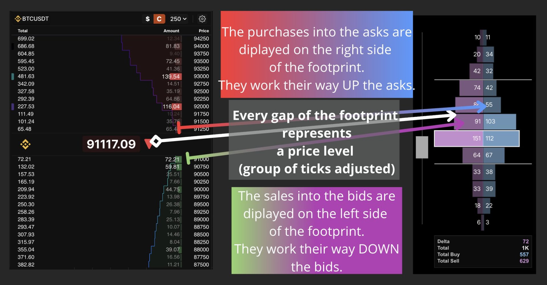
Right side very fat, good, price go brrr.
Left side very fat, no good, price no brrr.
Both sides fat, price balanced.
Below the footprint you have the stats for that candle and the delta. Delta positive, lotta buys. Negative, lotta sells. ok? good.
Oh, and you read it diagonally, Anon. It's not a mirror. We read in that stunning infographic above that the little black gaps in the footprint bars are the price levels. So the filled bids are on the left below the gap, and filled asks are on the right above the gap.
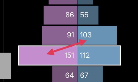
Now, in a footprint, you have a Point of Control (white border), a Value Area, and Value Area High/Low. They work the same as market profile, but they are strictly volume-based here.
PSA: I will not explain concepts I already analyzed in the Market Profile series, so go back and read them if you didn't. This stuff takes me so much time already.
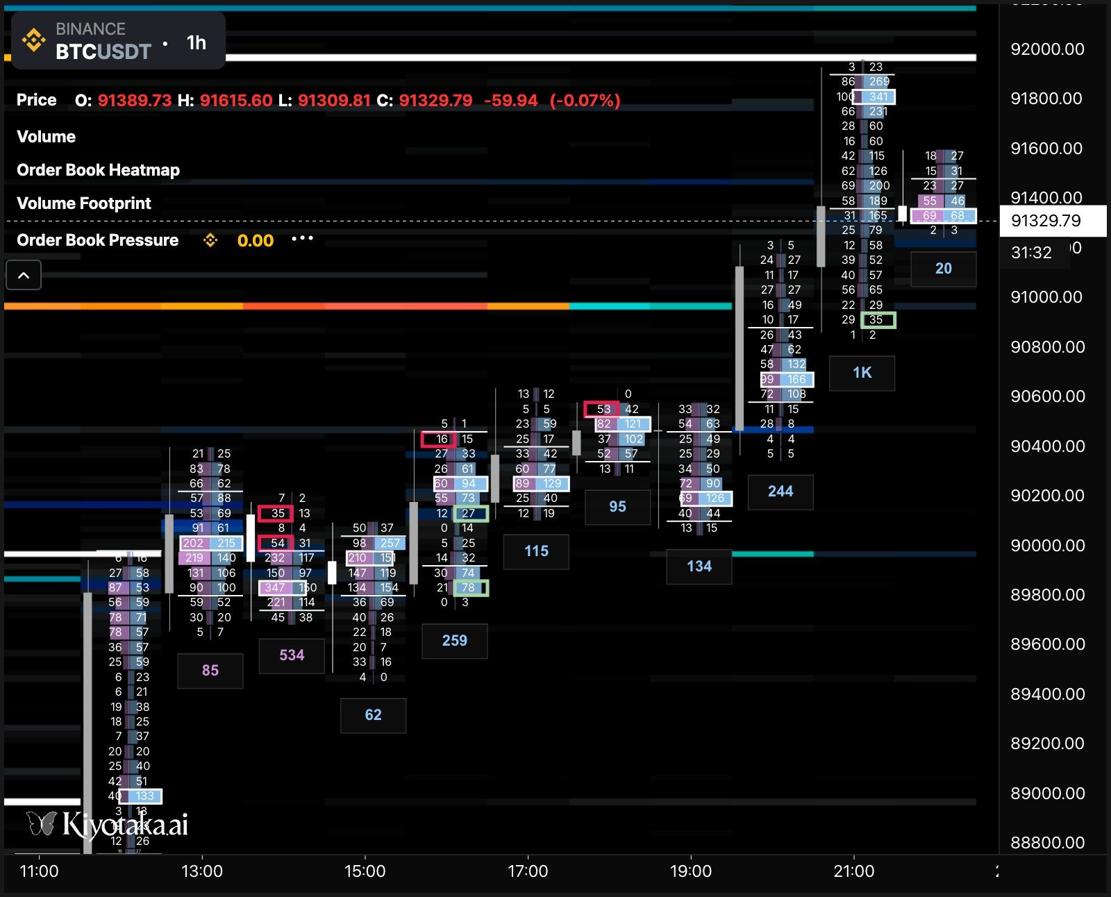
Finally, you have imbalances. An imbalance is a difference between filled bids and asks for a certain price. The default setting is a ratio of 10:1. Imbalances in favour of Buys are highlighted in green, and in red for Sales.
The Heatmap.
You can see where the orders rest directly on the chart. The hotter the color (from black to white), the larger the order block sitting at a certain level.
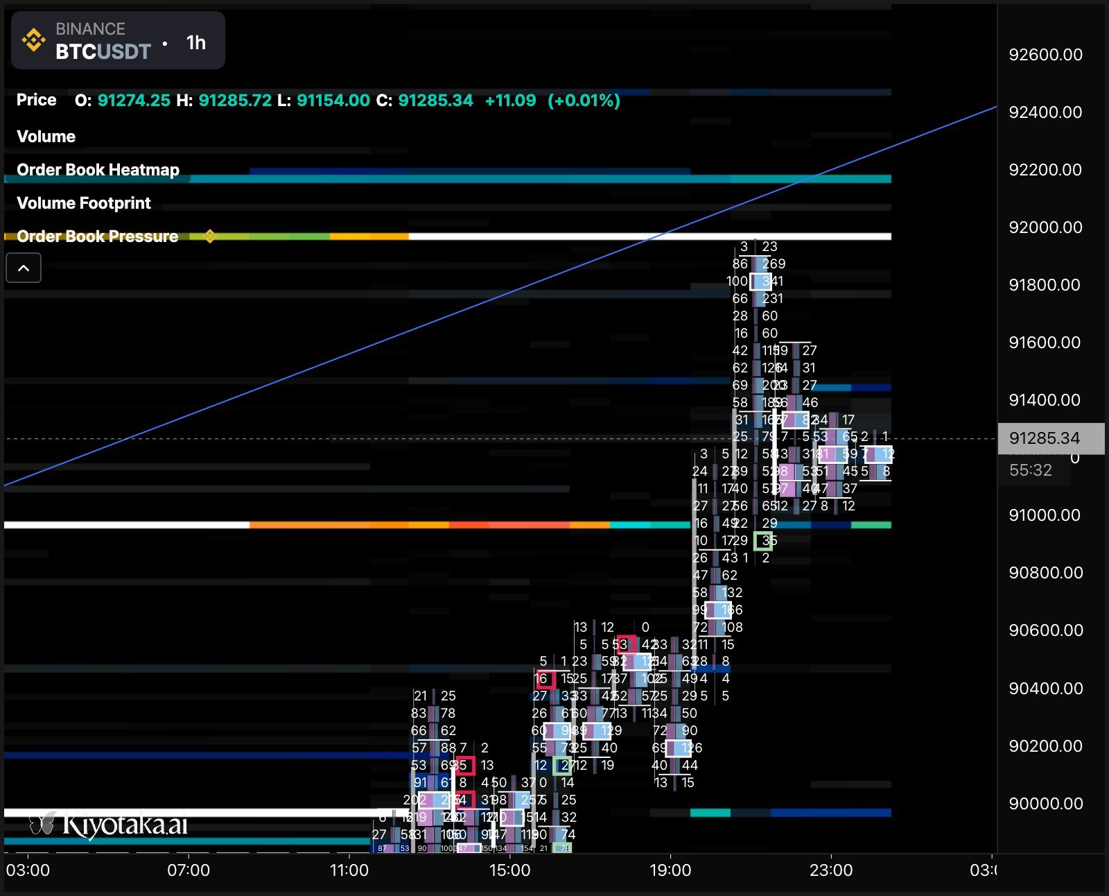
Remember the orderbook? Basically, same thing, just visualized on the chart. So orders sitting above the price line are limit sell orders, and the ones below are limit buys. Now it's easy to understand, right?
And if you hover the mouse on a cell, you can see the orders sitting in the cell, as well as a few cells above and below, as well as orders in the previous candle time.
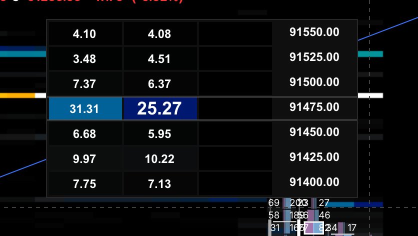
Why is this important? You can see if someone was posting an order and then removed it. We call this spoofing. With time, you will realize that most sell and buy walls vanish when the price gets there, and you can even recognize certain players by order size, because the fucking clanckers use the same size every time.
There's an 82 lots guy always playing this game on Binance spot, for example. He knows I know now.
2. Limitations
Hidden orders: as I told you, only booked limit orders can be seen in the order book. Market orders are a surprise.
Spoofing: there's no way to know for sure what's spoofing and what isn't; experience helps a bit, but you cannot count on it 100%.
3. Exercise
Please try to practice with these tools before the next article. Toggle them on your chart and start observing what happens.
Try to answer the following questions:
a) what happens on the footprint when price goes up?
b) what happens on the footprint when price goes down?
c) what happens to delta in case price goes up/down, and do you notice anything happening to delta during reversals?
d) what meaning can you give to imbalances?
e) do you notice any similarity between Market Profile and Footprint?
4. The Toolkit
We will build the toolkit as time goes by, and with each article, I will explain a few tools and how to implement them into our strategies. You can select which ones you want in your toolkit. Remember, use this content along with what you already know from the previous articles.
So far, we have order book, footprint, and heatmap.
In the next article, we analyze the Terminal (read the user manual, Anon. It's long, but it's worth it) and a few indicators, as well as their utility for trading in this asylum.
Until next time.