Guide to Time Price Opportunity
Video Walkthrough
We’ve prepared a full video walkthrough of this guide. All material covered in the video is also explained in the text below. We recommend watching the video first, then using the written sections for detail and reference.
1.0 What Is A TPO?
The Time Price Opportunity chart, pioneered by J. Peter Steidlmayer in 1984, is a chart designed to illustrate the amount of time spent at each price level traded during a given time period. This tool can provide traders with insights into which price levels were accepted and rejected by the market.
2.0 Anatomy Of A TPO
2.1 TPO Blocks
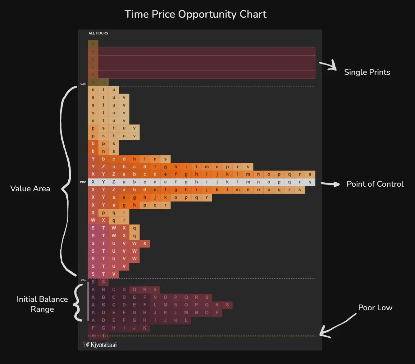
The core component of a TPO is the distribution of blocks. For each price level that the market trades throughout a designated time period, a block is printed onto the TPO chart. The blocks are typically labelled letters from A → Z, then a → z. By default, the block size is set to “30m”, so a new letter prints every 30 minutes and price action is grouped into 30-minute segments.
2.1.1 Letters
Marked chronologically from A → Z then a → z, the letters indicate when the market traded through each price level in the TPO distribution. For a given session, the first “block” of time is labelled with “A”, the second with “B”, and so on. Once blocks are labelled with “Z”, the series continues from “a” to “z”, with “z” representing the final time block within the session. By default, a new segment prints every 30 minutes, labelled by the next letter in sequence. This is useful for traders who trade around certain times within a given session. For example, “NY Open” or “UTC Close”.
2.1.2 Initial Balance Range
The IBR represents the opening price range of the TPO. Classically, the IBR refers to the first hour of trading during a given session, but this can be calibrated based on personal preference. By default, this is set to “2” TPO segments and is indicated by the white vertical line on the left of the TPO. If block size is set to “30m”, the IBR will contain the first 2 segments of 30 minute intervals totaling to 1 hour - groups A and B.
2.1.3 Poor Lows/ Highs
A poor low or high represents a session low or high where 2 or more TPO blocks are stacked horizontally. This means the market traded at the price in question for a prolonged period of time, as both buyers & sellers were present at that level. A poor high shows a lack of aggression from sellers meanwhile aggression was displayed by buyers. As a result, the market can often revisit these levels. This can be useful for traders who use lows & highs as points of interest.
2.1.4 Single Prints
Single prints represent a price range with only 1 block printed. This means price traded very quickly through this level and indicate price levels with low trading activity and/or relatively strong aggression from either buyers or sellers. By default, a red horizontal rectangle prints at a price level where only 1 TPO block is present.
2.1.5 Naked Key Levels
A naked key level, such as a naked single print or point of control, is a key level which has been set and not yet revisited by price. These can be projected forward into time and monitored as levels for potential price reaction.
2.2 Point of Control
The PoC represents the price level where the market spent the most amount of time during a given session.
2.2.1 Value Area
The Value Area captures the price range where price traded for ~70% of the time within a given session
2.2.2 Value Area Low
The value area low is the lower extremity of the value area. This can act as support/resistance.
2.2.3 Value Area High
The value area high is the upper extremity of the value area. This can act as support/resistance.
3.0 Aggregated Time Price Opportunity
Since crypto is traded 24/7 across the entire globe, an aggregation of trade activity across multiple exchanges can be a powerful tool for identifying general overall market behavior. This section will cover how to use this indicator in Kiyotaka.
3.1 Settings
3.1.1 Source
Exchanges
- Select the exchanges you wish to display
Session Type
- Select the length of time you want included in each TPO
Trading Hour
- Define specific hours/trading sessions to isolate your TPO to, or include “All Hours”
Block Size
- Define the amount of time per block.
- E.g. If set to 30m, a new letter will appear every 30 minutes
Show Letters
- Toggle display of letters on TPO blocks
Volume Profile
- Toggle the addition of a volume profile in addition to the volume profile orientation and view.
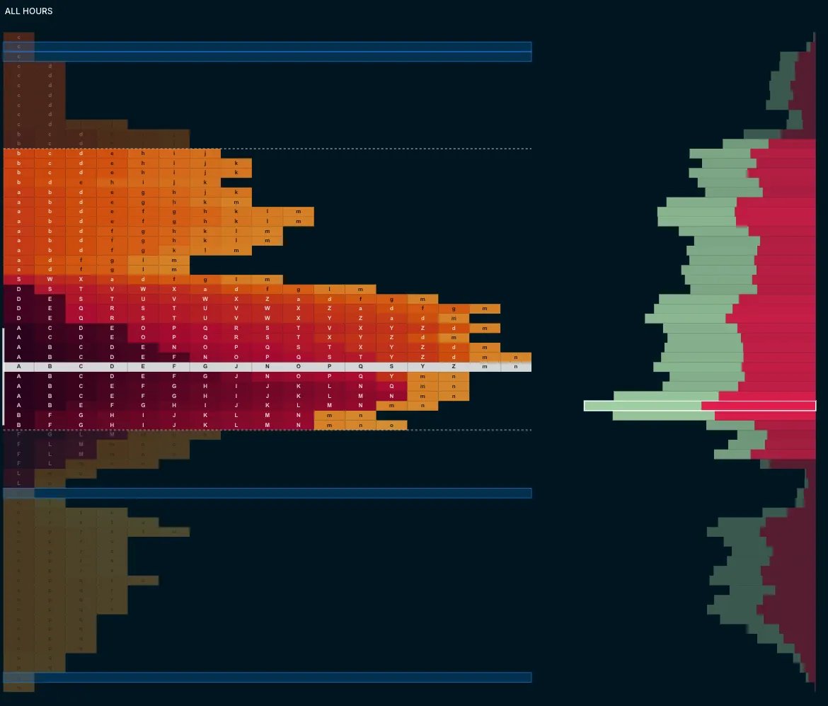
Value Area (%)
- Define the % of “trading time” to include in the value area plot
Ticks Per Bar
- Define the # of ticks to include in each bar, adjusting the vertical height of the TPO boxes. One tick is approximately $5 USD so if tick size is set to 1, each block will have a height of approximately $5.
Trading Hour Label
- Toggle a label which states the chosen “Trading Hour” setting
POC Summary
- Toggle a summary of POC and value area price data. Optionally, you can add volume delta, total buy, sell, and overall volume summaries.
3.2 Style
Outside VA Opacity (%)
- Set your preferred opacity of the TPO blocks beyond the value area
Point of Control (POC)
- Toggle display of the POC, customize the color of POC blocks, toggle extension of naked levels forward into time until revisited
Value Area High & Low
- Toggle display of both these levels, customize the color, and toggle extension of naked levels forward into time until revisited
Initial Balance Range (IBR)
- Customize the color of the vertical line next to the initial balance range and define the period. The period dictates how many letters are visually included in the initial balance
Poor Highs/Lows
- Toggle the marking of poor highs/lows, customize the color, show a text label, and toggle extension of poor highs & lows forward into time until revisited.
4.0 Merging Multiple TPOs
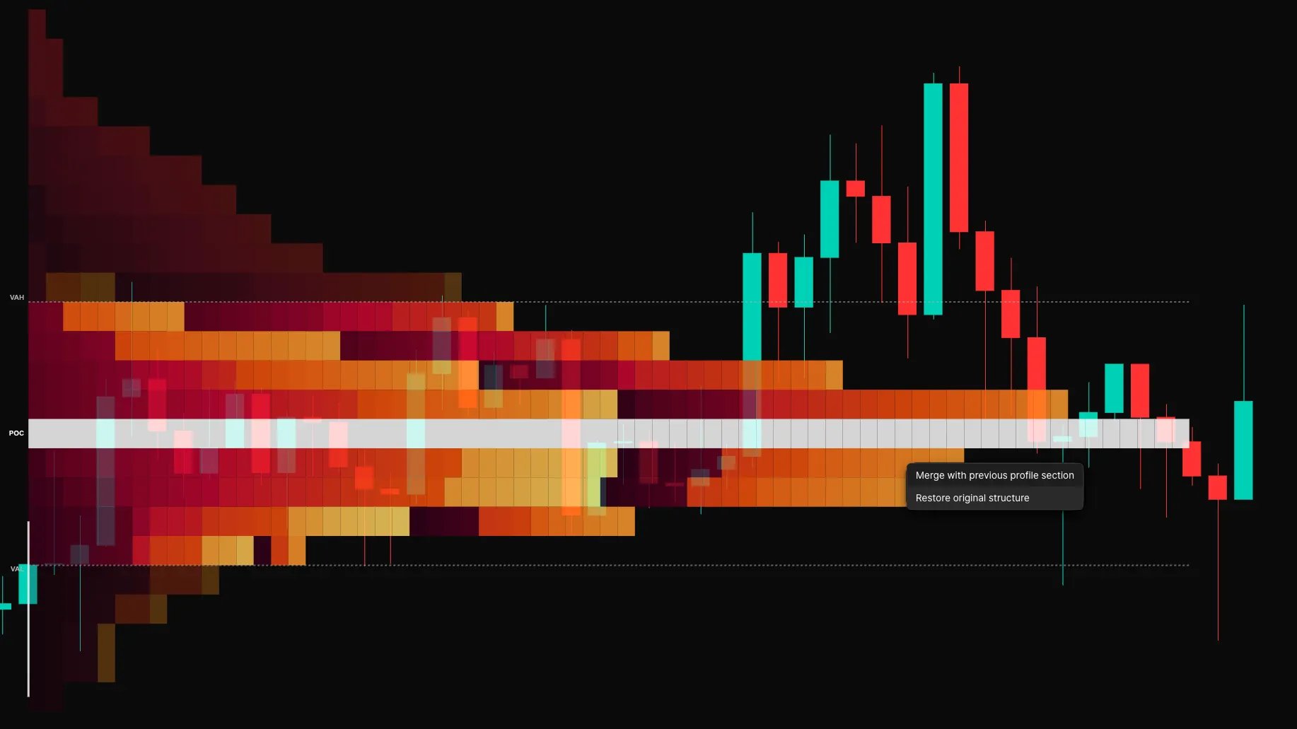
TPO Profiles can be merged together allowing traders a birds-eye view of the market context over multiple sessions.
To do this, right click a profile and select “Merge with previous profile section”.
This new profile can then be merged with more previous profiles.
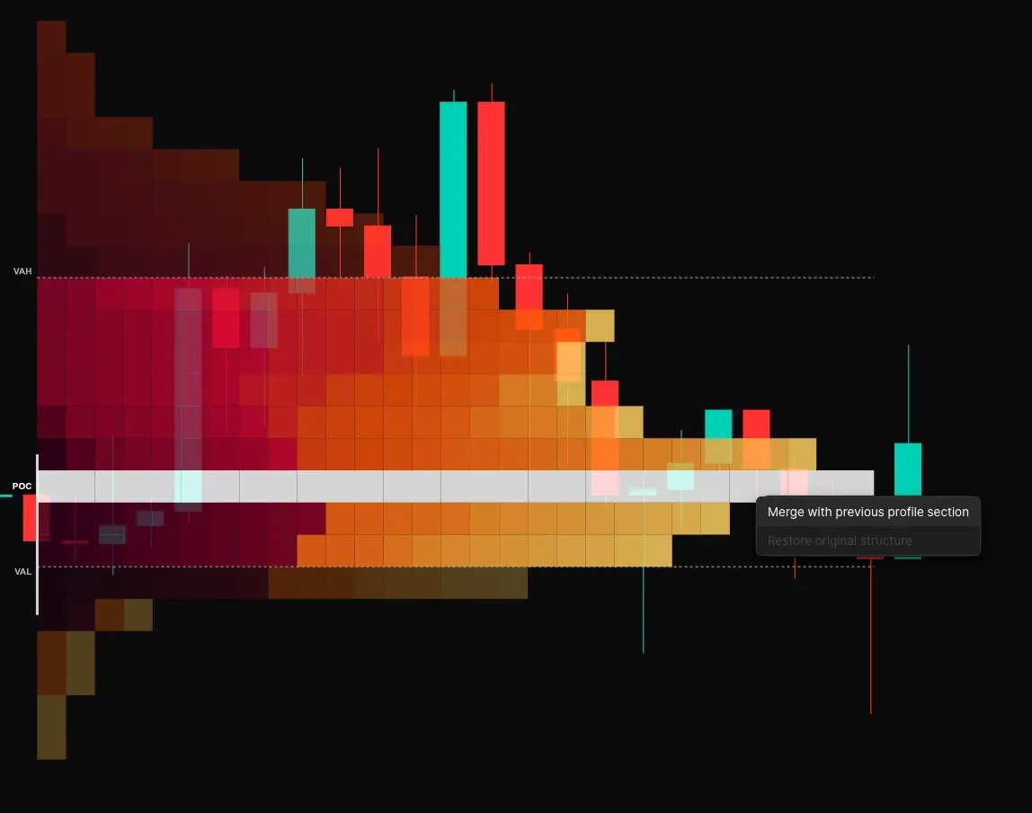
To un-merge the TPO’s, right click the merged profile and select “Restore original structure”
5.0 Interpretation of the TPO
There are many ways to analyze and interpret the abundance of information the TPO provides. By learning how to interpret the TPO, traders can uncover confluence with other market indicators, reduce the signal noise during trading sessions, and focus on select high quality setups to execute strategies around.
Before diving into the TPO, we must first take a step back and internalize the core fundamental market states.
5.1 Fundamental Market States
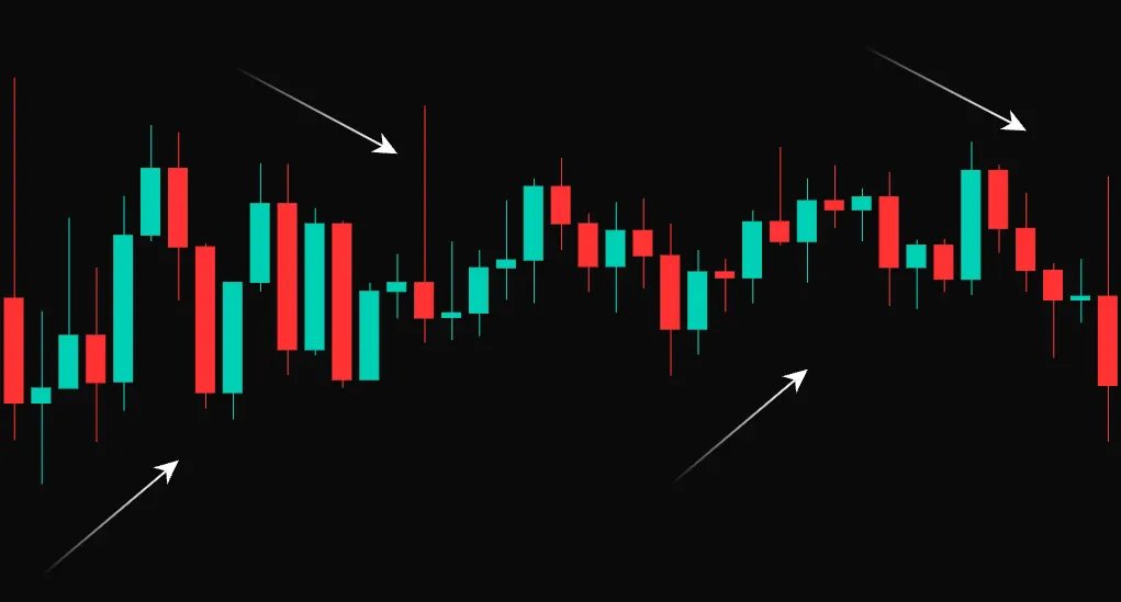
Conventional price action considers 2 fundamental market states: ranging price action, and trending price action.
5.1.1 Ranging Price Action
- Market is “bouncing” between a high price and a lower price
- Tend to last longer than trends. Many transactions occurring
- Markets spends the majority of its time in a range
- Balance of supply and demand
Ranges occur when there is a balance between buyer aggression & seller aggression. Therefore we can say that the market found “fair value”
5.1.2 Trending Price Action
- Quick, explosive, one-sided move
- Often initiated by some catalyst (macro news, etc.)
- Imbalance of Supply and Demand (excess supply, lack of demand)
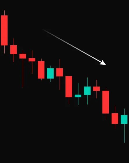
The downtrend pictured above occurred because of excess sell aggression and lack of demand. This is called an imbalance.
5.1.3 Balance & Imbalance
This cycle between balance and imbalance is ongoing in all markets, on all time frames. As traders, we typically look to capitalize on periods where the market transitions from balance to imbalance.
The TPO is an effective tool for identifying key price levels where the market was in balance, and where the market transitioned to imbalance. The next section will establish why these phases of balance & imbalance are so significant.
5.2 The Mind of A Market Mover
Let’s say you are the manager of a $10 billion fund. For simplicity, let’s say you wish to take a long position with 100% of your capital. This begs the questions:
- Where do you enter the market?
- Where do you exit the market?
Of course you’d want to buy at discounted prices and sell at a premium, but it’s not that simple. If you are taking a $10 billion position, that means you need $10 billion worth of sellers as a counterparty. Unless BTC is already at the top of a bull market, it would be hard to find that many sellers all at once. So, you will have to spread your accumulation out across some span of time or another logical unit of measure. But if you don’t act fast enough, the market may sway against your favour.
Additionally, as you buy into your position, the price of BTC would increase due to the elevated level of demand being displayed in the market. But if you buy too much too soon, you’d immediately be in drawdown.
- So what’s the solution?
Well, there is no perfect answer. However, you can save yourself a lot of money if you transact in a ranging, balanced market instead of a trending, imbalanced one.
- Why?
In a balanced market, there is a healthy amount of active buyers and sellers. This is why price ranges between a high and low.
This means you can buy BTC at a price where there are plenty of active sellers (sell-side liquidity) and therefore segment your position into multiple entries.
6.0 Balance & Imbalance: October 2025 Case Study
Here is an example which illustrates the dynamic of balance and imbalance which dictate the markets.
6.1 October 9th 2025: Balance
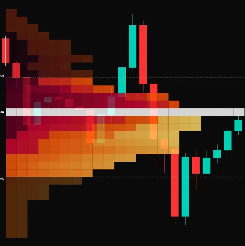
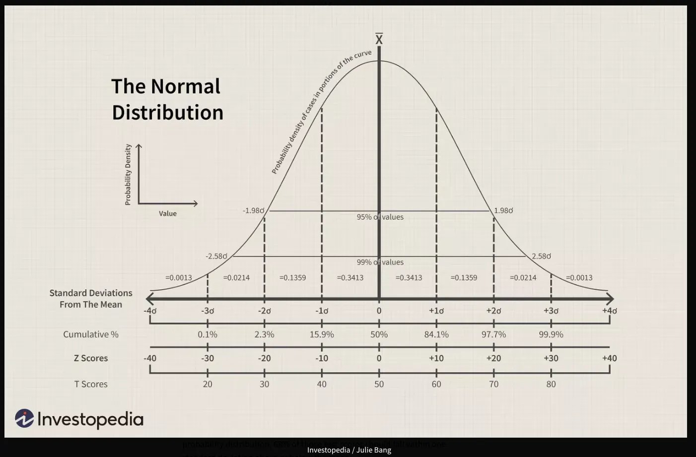
The TPO of a balance session roughly resembles a normal distribution, where the majority of trading activity occurs within the first standard deviation of the mean.
A balanced market is referred to as “efficient” price action because both buyers & sellers can efficiently fill their orders within this range.
Since the market was trading at a fair value, it can be expected that a phase of balance will continue until some catalyst incentives either buyers or sellers more, creating imbalance between sell-side supply & buy-side demand.
6.2 October 10th 2025: Imbalance
Imbalance sessions are easily identified by their skew, or lopsidedness toward one side.
On October 10th, the session began in balance, in accordance with the previous day’s trading activity. Price compressed into a very narrow range where it spent the majority of the session.
After mid-session, a catalyst in the form of tariff news, led to a liquidation cascade, where buyers were forced to sell off their positions. This created an excess of supply with a lack of demand; imbalance.
As a result, the market propelled to the downside in search of buy-side demand, and did not stop until enough demand was found to balance the market. This downward trend is also referred to as “inefficient” price action.
6.3 October 11th - Balance
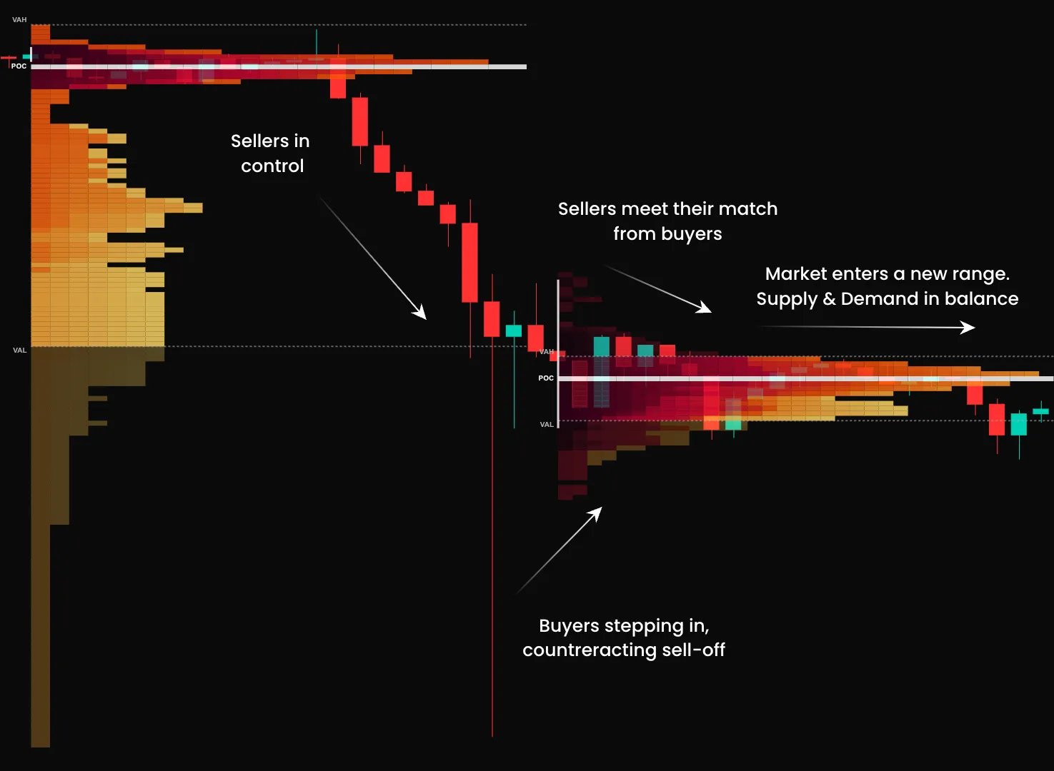
In the aftermath of the downside cascade, the market found demand at lower prices. This demand was strong enough to balance the supply in the short term, resulting in a state of balanced, efficient trading on October 11th.
6.4 The Key Takeaway
The market is in a perpetual state of seeking balance.
Catalysts can influence the market, creating an imbalance, but the market will not trend forever and will always return to a state of balance.
Additionally, unless there is some fundamental catalyst which caused the imbalance, the market often returns to prior levels of imbalance to “repair” the inefficiency and create a new level of balance.
As traders, we can deploy different strategies that capitalize on these market regimes.
Trend-following strategies tend to work better in periods of imbalance.
Mean-reversion strategies tend to work better during periods of balance.
7.0 Merging TPO Profiles
7.1 Key Levels On The TPO
There is a multitude of key levels displayed on the TPO and many different ways to form trade theses around these levels, and within market context. The key concept to carry through your analysis is, the TPO shows us where the market wants to do business, and where it doesn’t want to do business.
In this section, we will study key levels on the TPO, dive deeper into their characteristics, and explore methods of forming expectations for market behavior should the price revisit these levels.
7.2 Point of Control (PoC)
As previously discussed, the PoC is where the market spent the most time trading. As a result, we can consider it to be the single “fairest” price of the trading session and therefore act as support/resistance in the future.
If price originally trends up from PoC, then begins to trade back down to it, we can expect bulls to defend their position. The PoC may therefore act as a support. This is also true in the opposite case for bears.
7.3 Value Area
The value area is the range of prices which the market deemed to be fair value during a given session. As a result, the market spent ~70% of the session trading somewhere in this range.
7.4 Value Area Low & High (VAL, VAH)
The VAL and VAH represent the lower & upper extremes of the range where the market traded for ~70% of the session. These are also the extremes of the prices which market deemed to be fair value, and can therefore act as support and resistance, respectfully.
These 3 levels can be layered in confluence to formulate trade theses. Here is a case study:
7.5 Price Action Study October 26 - 28th 2025: Deriving Key Levels From The TPO
In this example I’ve extended some of our key levels forward into time. To study how price reacts to them at a later date.
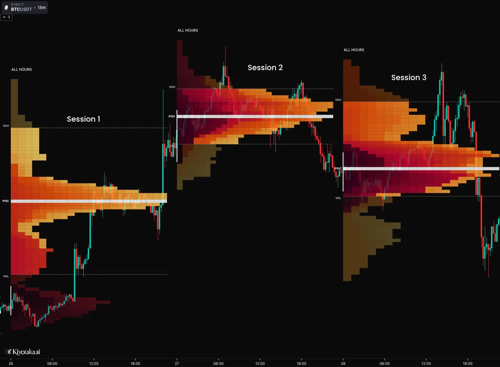
Below is an explanation of how price treated these levels.
- Session 1: Established Fair Value, traded up from value area
- Session 2: Continued trending up until a new balance is found.
- Entered into a downtrend towards the end of the session, exiting the VA and retesting the VAL pushing lower
- Session 1 PoC remains untouched (or naked)
- Session 3: Continued to push price lower, retesting session 1 VAH. Strong demand found at the 1st sessions PoC. Price rallies up to retest the key levels from Session 2
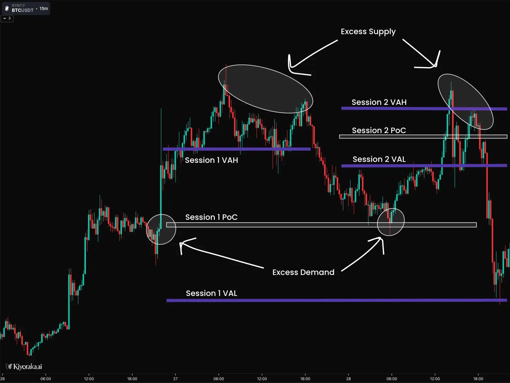
Session 1 VAL:
After session 2 entered into a downtrend, the market searched for balance by retesting previous zones of balance.
Session 1 VAL originally acted as support until price traded below it, turning the 1st session VAL into resistance.
Session 1 PoC:
The market ranged between session 1 VAL and PoC until strong demand was shown by bulls who protected their longs in the Session 1 breakout and short sellers taking profits.
This caused price to trade below the Session 1 VAL and retest the next zone of fair value VAL.
Session 2 VAL:
This level originally acted as resistance until buyers took control, pushing the auction higher. Price traded through the S2 PoC and up to the S2 VAH.
Session 2 VAH:
Price originally tried to trade above but failed, falling back below due to bulls taking profit and sellers opening positions.
This caused price to trade back down into the S2 Value Area, ranging between S2 VAL as support and S2 VAH as resistance. With S2 PoC roughly in the middle of the trading range.
Eventually, buyers conceded to sellers who took control, pushing the auction lower through these key levels until a new balance was found.
This is just one of many examples which clearly illustrates the market’s ebb & flow between balance and imbalance. Additionally, it’s evident that these TPO levels are significant not because of some esoteric mathematical theories or sophisticated algorithms governing the markets, but because it is rooted in time, supply & demand.
The TPO also displays other signatures which can be layered in confluence to form intelligent trade theses in alignment with market context. The next section will cover these signatures.
8.0 Details Matter
There are a few more signatures of the TPO which provide us clues for why the market is in its current state, and suggest what may happen in the future. This section will detail examples of these levels in action.
8.1 Single Print: Oct 25-26 2025
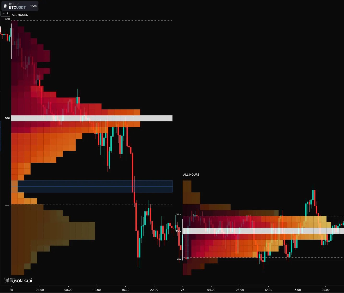
In this example we identify the single prints from the Oct 25th TPO where a large amount of seller aggression quickly forced price below the level. On the following day, price attempted to push above this level but rejected below. This was due to a lack of demand at higher prices, and potentially sellers defending their positions at this key level.
8.2 Initial Balance Range: Oct 29th 2025
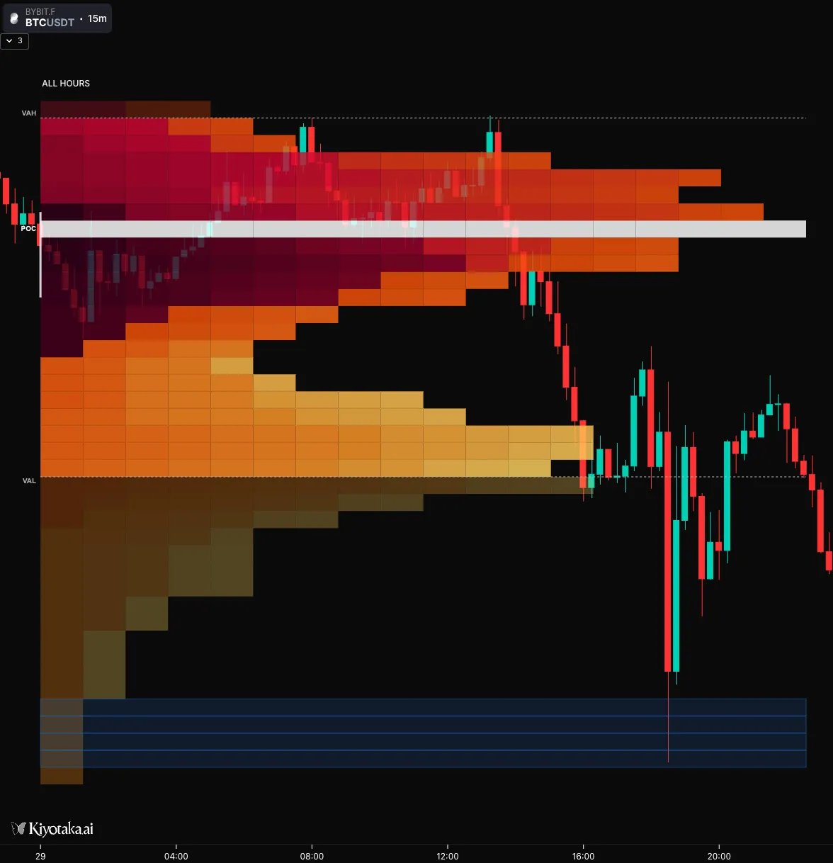
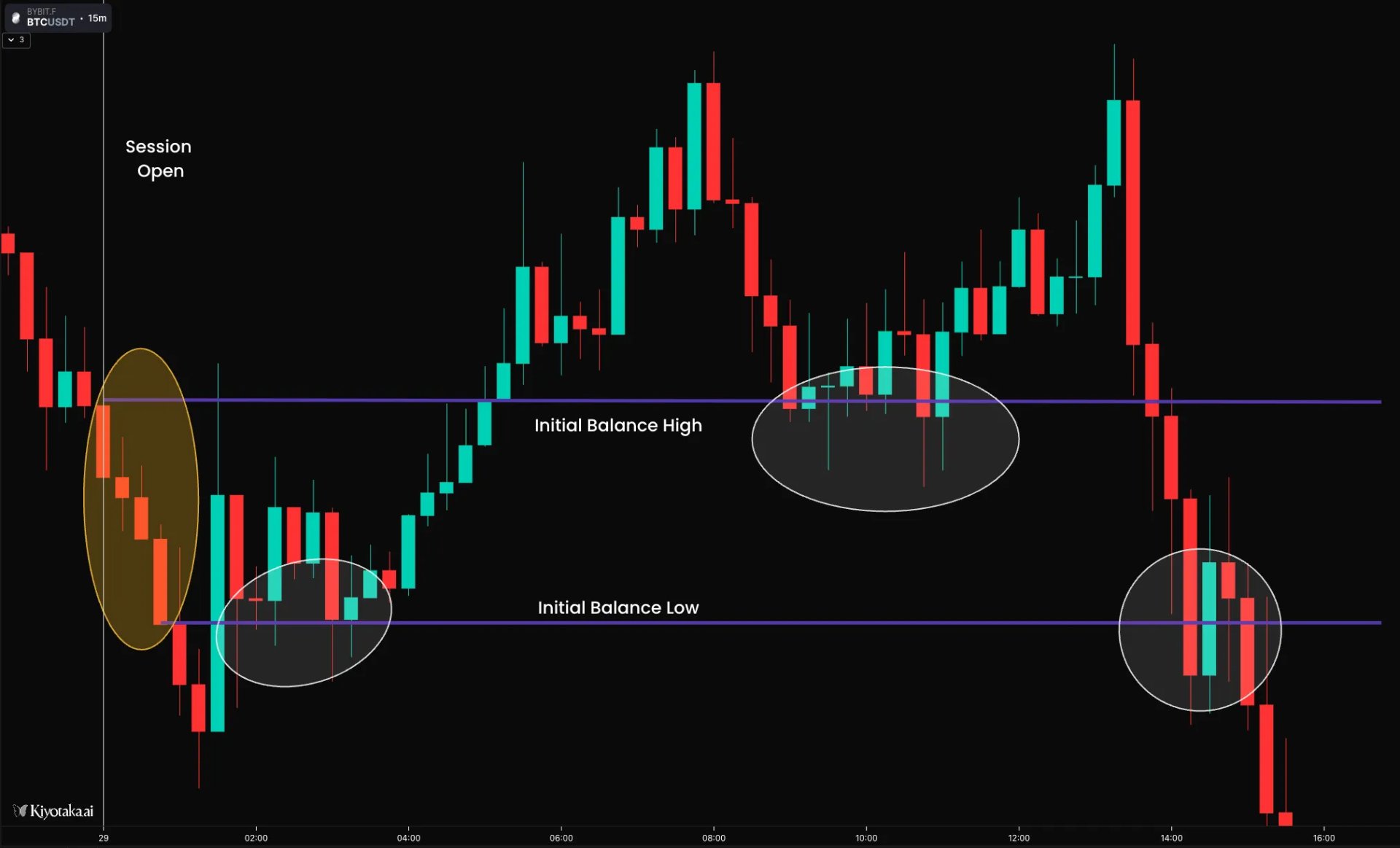
In this session, we see the Initial Balance formed the first 4 bearish candles of the session circled in yellow. The IBR high and IBR low are marked with purple lines for future insights. Once the trend was exhausted, price re-entered the IBR where it held IB Low as support. Later on, price traded above the IBR where the IB High acted as support before price traded back into the IBR. Price continued trading down through the range where the IB Low acted as a short term support until the down trend continued.
9.0 Poor Lows/Highs: Sept 20th 2025
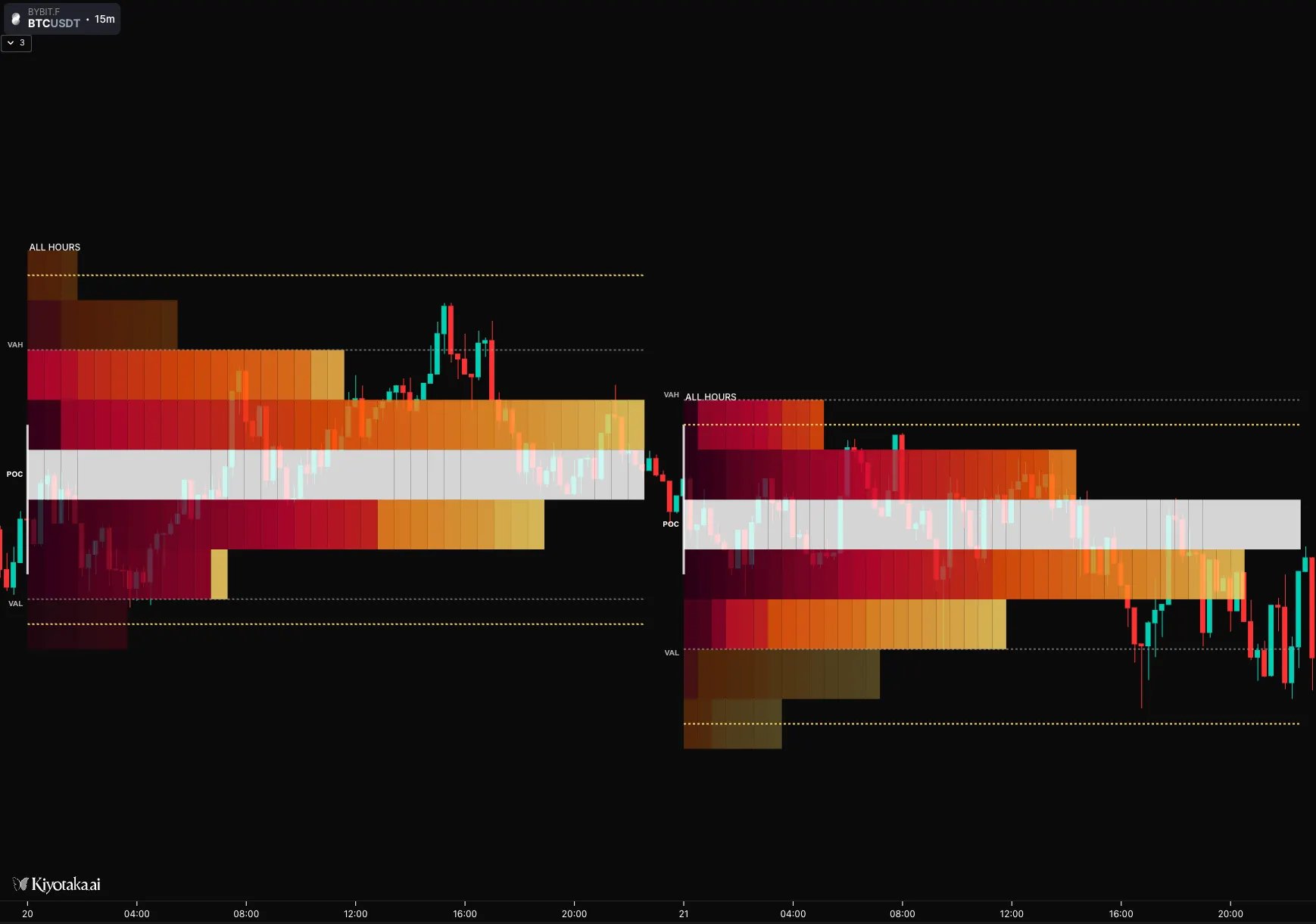
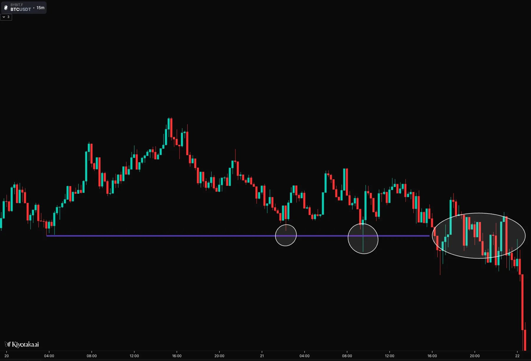
In this example from Sept 20th, we can see that both a poor high and low were formed. These are price levels where both buyers & sellers were willing to do business for at least 2 TPO periods/block sizes. As a result, you can expect both buyers & sellers to be active at those levels again.
Price traded down to it twice where buyers were responsive before revisiting it a third time where both buyers and sellers became quite active. Eventually buyers conceded, resulting in an explosive trend to the downside.
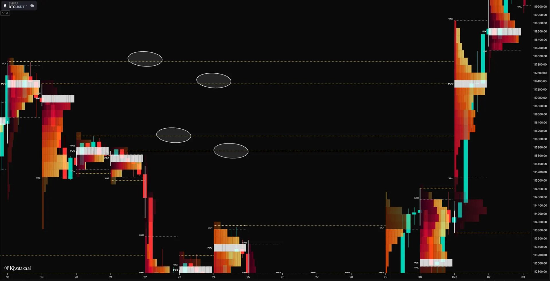
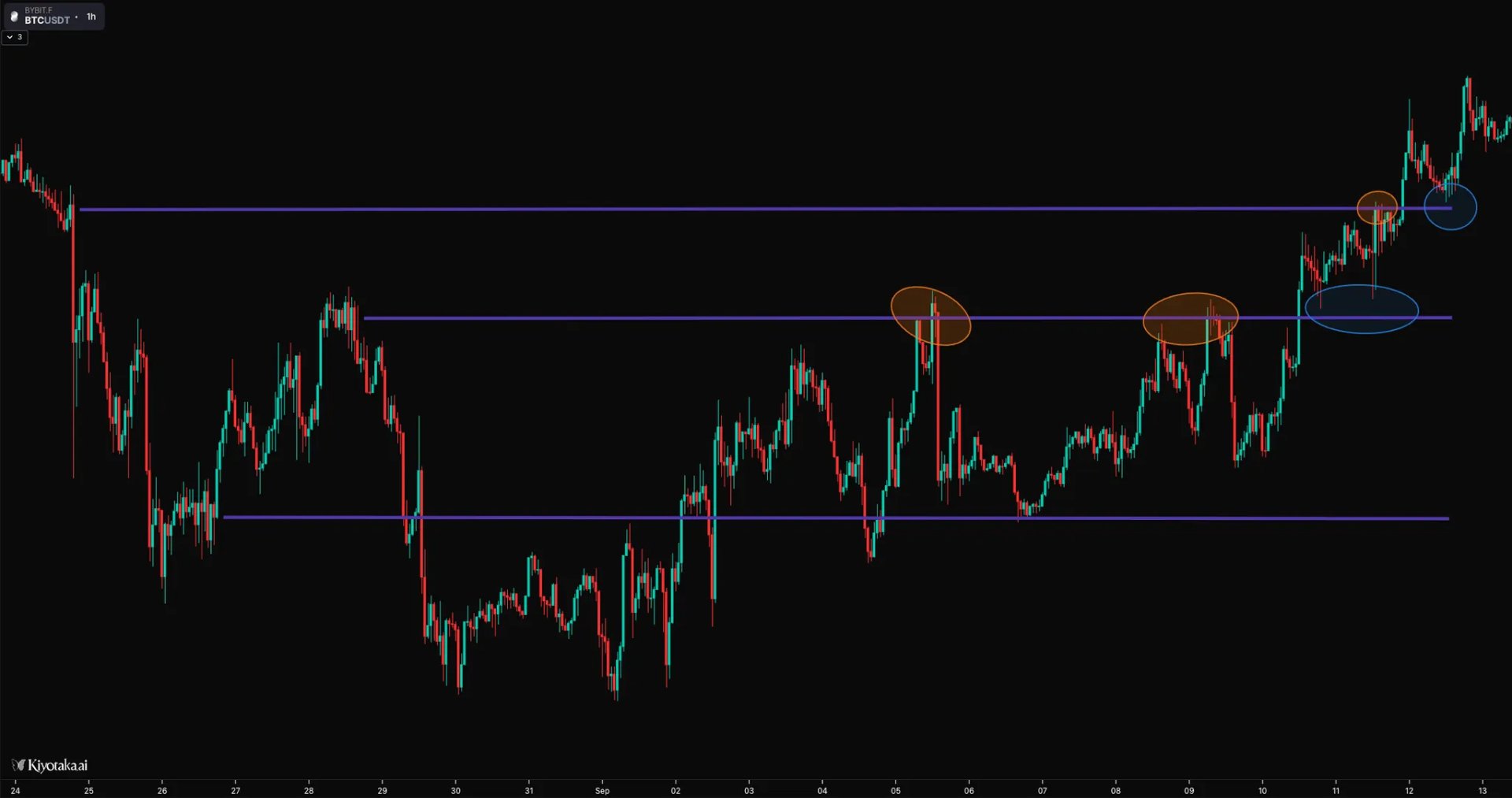
10.0 Naked Extensions: Aug, Sept 2025
Since naked extensions represent key untested TPO levels, monitoring them forward in time can provide valuable trade setups and insights into evolving—or unchanging—market dynamics from prior sessions.
This example illustrates a series of daily POCs that remained naked during a downtrend until the market reversed and revisited them. Note how these levels initially acted as resistance before flipping to support upon acceptance, but not in every instance.
11.0 Conclusion
So far through this guide, the key principles we’ve established are:
- The market moves from states of imbalance to balance to satisfy the business terms of both buyers & sellers.
- Large institutional traders are more inclined to execute substantial positions in balanced markets, capitalizing on price stability and increased liquidity for efficient, low-impact order fulfillment.
- The TPO shows us a running record of points of interest. Some of these levels exhibited an increased length of activity, while others show a significant lack of it.
- While never a guarantee, these levels can be layered in confluence with market context to generate logical trade setups of many different styles, be it mean reversion or trend-following, and even non-directional trades.