Guide to Volume Footprints
Video Walkthrough
We’ve prepared a full video walkthrough of this guide. All material covered in the video is also explained in the text below. We recommend watching the video first, then using the written sections for detail and reference.
1.0 Introduction
Every price movement in the market starts with an exchange between buyers and sellers. Candlestick and line charts only show the outcome of these battles, where price ended up.
Footprint charts give you an inside look at the action, revealing how much trading took place at each price level and which side was in control.
There are three main footprint views: Split, Delta and Total, each offering a different way to interpret the flow of orders in the market.
2.0 What Are Footprint Charts and Why Use Them?
Footprint charts (also referred to as cluster charts) are a volume-based chart that shows exactly how much buying and selling occurred at each price level for each individual candle. Unlike candlestick charts, which only display the open, high, low, and close, footprint charts break down the activity inside each candle to show where buyers or sellers were more aggressive. They visualize order flow by displaying bid and ask volume directly on the chart, derived solely from market orders, allowing traders to see imbalances, absorption, and shifts in market pressure. This added layer of detail helps identify whether moves are supported by real participation or simply thin, low-volume pushes.
They show both bid and ask side executions. This helps traders assess which side (buyers or sellers) had more dominance during a price move.
Compared to orderbook heatmaps, which show resting limit orders (buy and sell walls), footprint charts provide a clearer view of executed activity as limit orders can be pulled, moved, or used for spoofing, giving a misleading sense of liquidity. Footprints, on the other hand, display where market orders actually traded, showing genuine commitment from participants. Traders using size often split or hide their orders across multiple levels (iceberg orders), so footprints reveal what truly occurred rather than what was merely displayed in the book.
3.0 Footprint vs Candlestick
Before we go deeper, let’s discuss how to read a footprint chart.
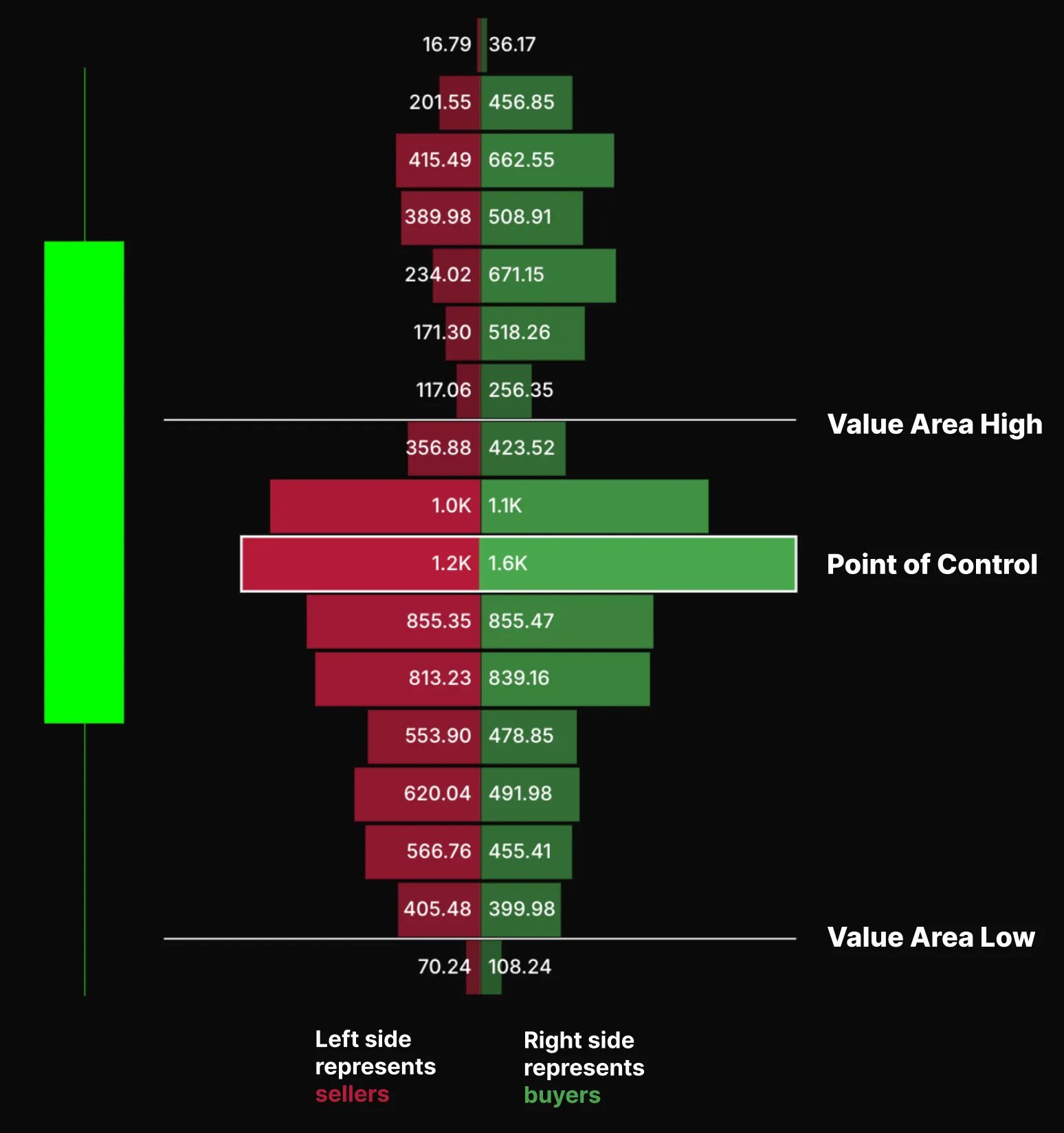
On the left side of the footprint, there are sellers who hit the bid (sold), on the right-hand side it shows the buyers who lifted the order (bought).
For example, at the point of control, there is 1.2k on the left, and 1.6k on the right, at that corresponding price 1.2k [BTC] coins hit the bid (sold) and 1.6k coins that lifted the order (bought).
4.0 Types of Footprint Charts
There are three most common types of footprint charts are Split (or bid/ask), Delta and**, Total (**orVolume Profile)
4.1 Split (or Bid/ Ask)
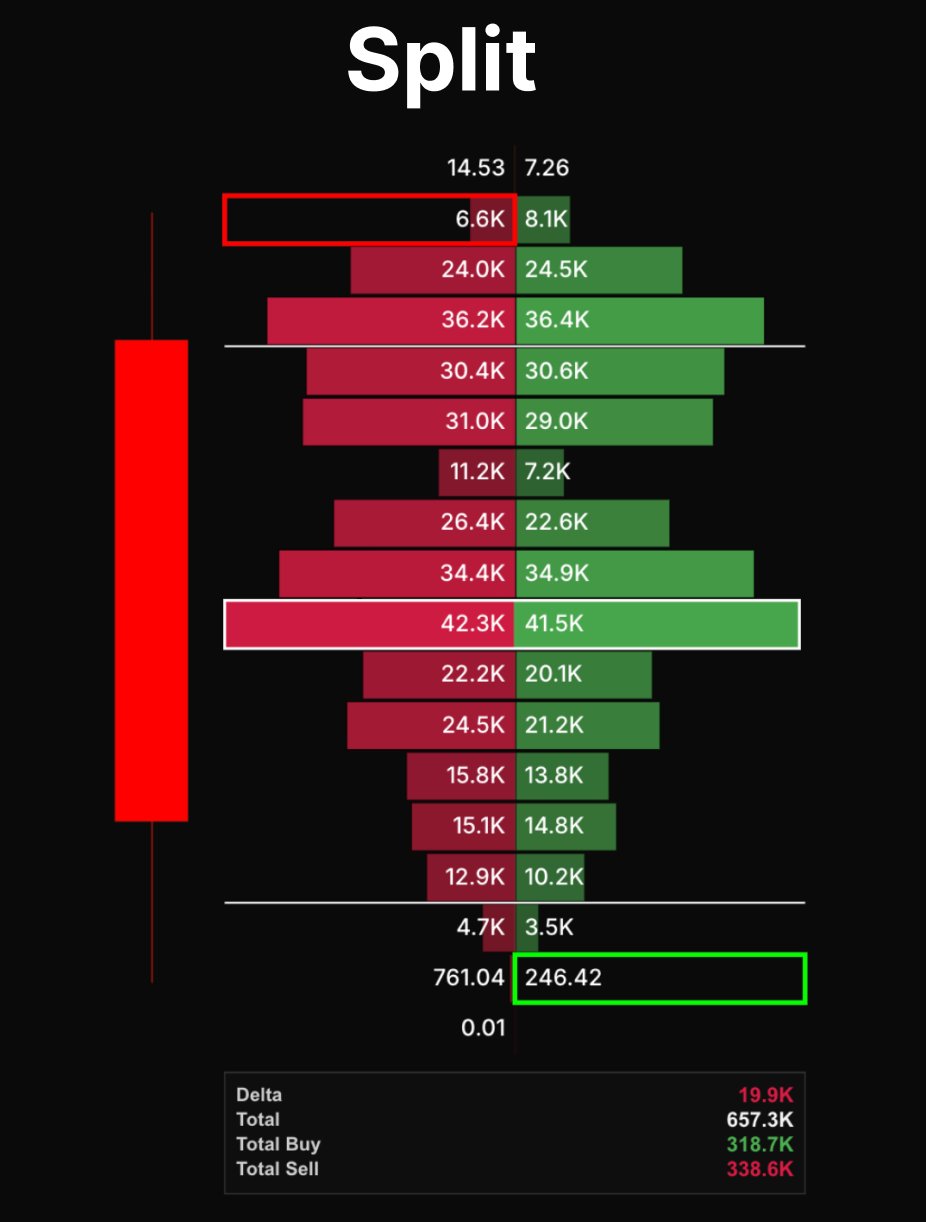
Split shows buying and selling volume separately at each price level. The bid side represents sell orders hitting the bid, and the ask side shows buy orders lifting the offer. This helps identify where aggressive buyers or sellers stepped in.
4.2 Delta
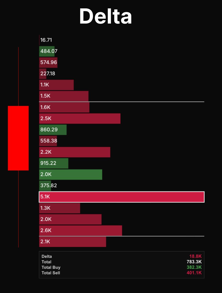
Displays the net difference between buying and selling volume (buy volume minus sell volume). It highlights imbalances, showing which side dominated at each price.
4.3 Total (or Volume Profile)
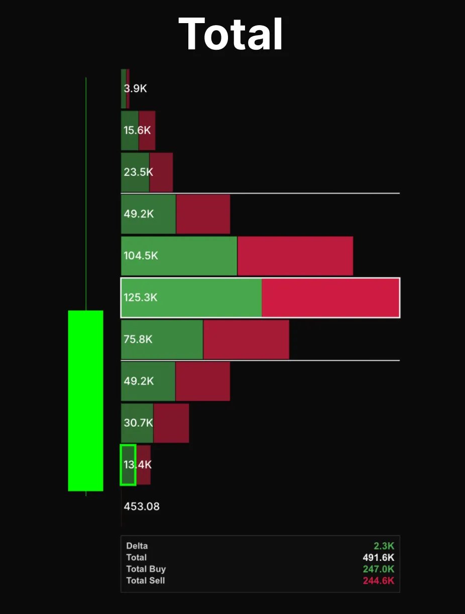
Combines all traded volume at each price level, without separating buyers and sellers. It’s used to spot areas of high activity, known as high-volume nodes, and levels where price may find support or resistance.
5.0 Footprints In-Depth
5.1 Split (Bid/ Ask) In-Depth
This is the most common view, it shows the buying and selling separately at each price level. The bid side represents sell orders that hit the bid, while the ask side shows buy orders lifting the offer. This gives a clear picture of who was more aggressive at each tick and price.
You use the split view to spot absorption (when one side repeatedly absorbs market orders without price moving. We’ll cover more on this later.) or stacked imbalances, where multiple price levels show heavy buying or selling. A cluster of strong buying imbalances often signals support, while stacked selling imbalances can indicate resistance or continuation strength.
5.2 Delta In-Depth
Delta shows the net difference between buying and selling volume. Highlighting which side controlled the candle. A positive delta means aggressive buyers dominated, while a negative delta shows stronger selling pressure.
Delta can also be analyzed through its maximum and minimum within a candle, showing the strongest buying or selling bursts before the close. Tracking cumulative volume delta (CVD) can help identify divergences. For instance, price making new highs while delta weakens may suggest fading buying strength.
It’s often used for:
- Confirming a breakout or fake out.
- Detecting buyer or seller exhaustion.
- Measuring momentum within a trend or absorption near key levels.
5.3 Total (Volume Profile) In-Depth
Shows the total traded volume at each price level, combining both buyers and sellers. This view focuses on where the most participation occurred, rather than who was in control.
High-volume areas (high-volume nodes) often act as balance zones or magnets, while low-volume areas (low-volume nodes) represent inefficient zones where price tends to move quickly through.
Use total volume profiles to identify:
- Value areas and points of control (POC).
- Support and resistance zones formed by heavy prior trading.
- Volume gaps, where price could move rapidly if revisited.
6.0 Key Notes for Interpreting the Footprint
Before going deeper, it’s important to understand the key elements of the footprint and how to read them effectively.
Value Area and Point of Control
The Value Area (Value Area High and Low) covers roughly 70% of total traded volume in that candle, marking where most activity occurred. The Point of Control (POC) is the single price with the highest volume, often acting as a magnet or balance point.
- When price returns to the POC and holds, that level can flip into support or resistance.
- Breaks of the VAH or VAL with strong delta often suggest continuation.
Delta Interpretation
Delta shows the net difference between buying and selling volume at each price level. A positive delta means aggressive buyers dominated the price action, while a negative delta shows stronger selling pressure.
- Large green delta at the candle’s low implies buyers defended that level.
- Large red delta at the high shows sellers absorbing buying pressure.
- Low delta indicates weak buying or selling pressure. This typically happens during consolidations or when neither side (buyers or sellers) is dominating, suggesting that a breakout or continuation may lack conviction. For example, if delta is low during a breakout, it may indicate that the move lacks strength and could reverse.
Now that we’ve covered the basics, it’s time to move into deeper concepts that give you actionable insights into footprint charts. These ideas go beyond simply reading the data they help you understand where traders are committing, where the market is likely to move next, and how to turn that information into real trading decisions.
7.0 Imbalances
A balanced market occurs when supply and demand are in equilibrium, resulting in stable prices. An imbalanced market happens when there is a large difference between supply and demand, leading to potential price movement.
What is an Imbalance?
- An imbalance occurs when the buying or selling volume at a price level significantly outweighs the opposite side. This creates pressure, often signaling a potential breakout or price move in that direction.
Why is it Significant?
- Imbalances indicate aggressive buying or selling, which can lead to a breakout. A large bullish imbalance suggests upward pressure, while a bearish imbalance signals downward pressure. Traders use imbalances to anticipate future price movements.
On a footprint chart, an imbalance occurs when the buying or selling volume at a specific price level is significantly larger than the opposite side. These imbalances are measured diagonally, comparing the ask volume at one price to the bid volume at the price just below it. A strong bullish imbalance forms when buying volume on the ask is much greater than selling volume one tick lower, while a bearish imbalance appears when selling volume on the bid outweighs buying volume one tick higher.
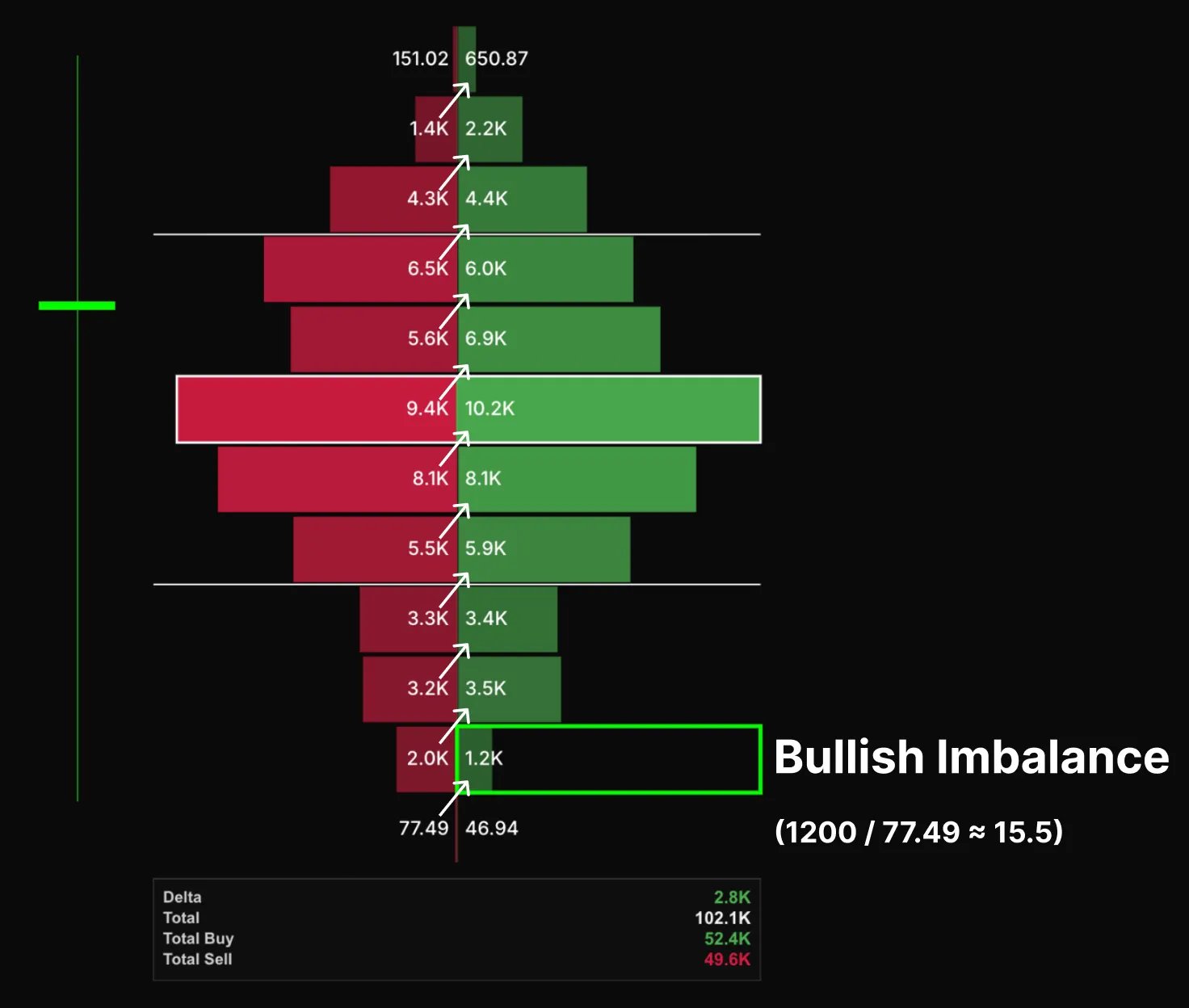
The imbalance ratio defines how large that difference must be to be marked. For example, a ratio of 10 means the buy or sell volume must be ten times greater than the opposing side for that level to qualify as an imbalance.
8.0 Absorption and Exhaustion
8.1 Absorption
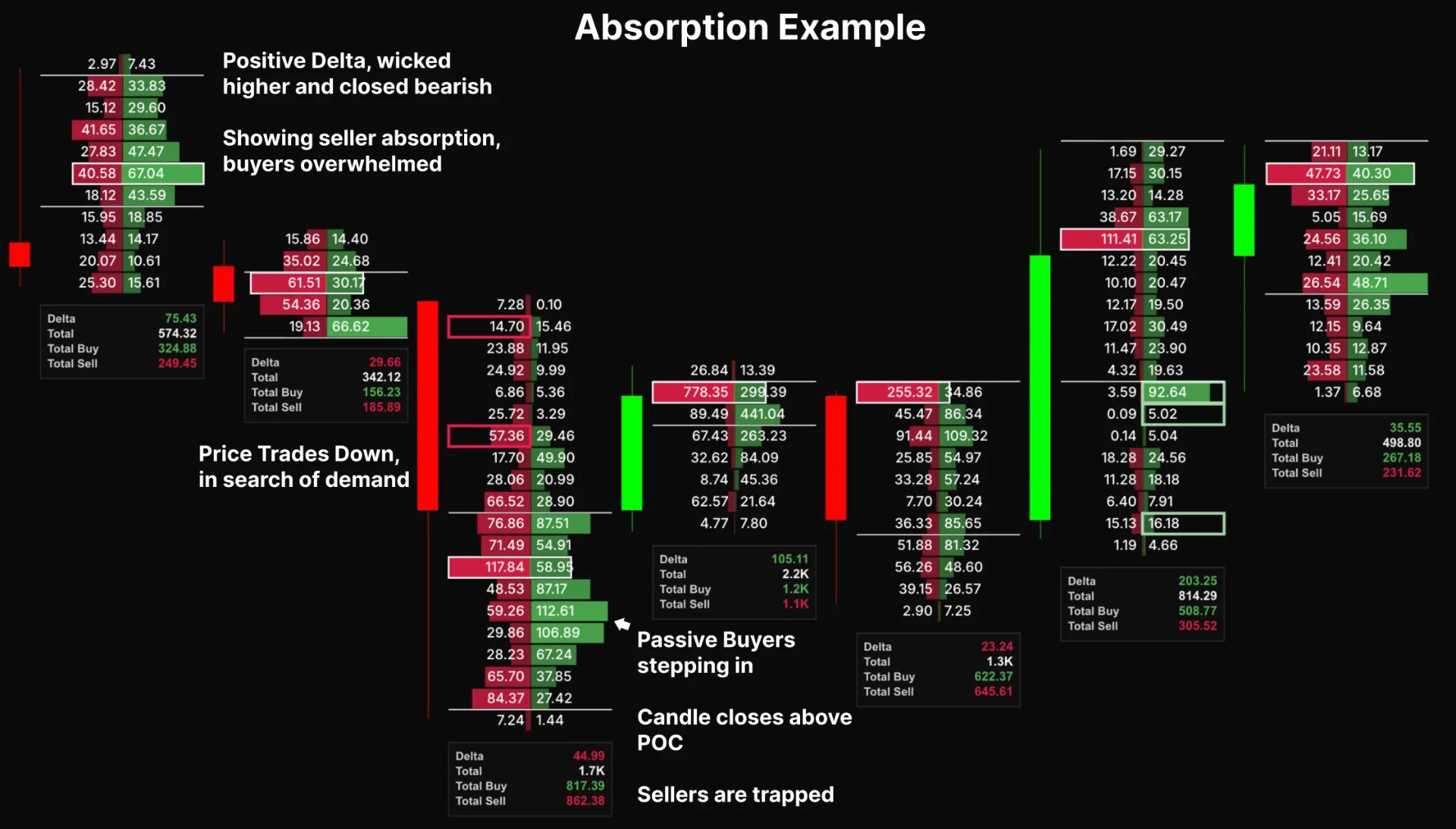
Absorption happens when one side (buyers or sellers) is trying to push the price in their direction, but the market isn't moving significantly because the opposite side is absorbing the pressure. This can be a signal that price is either consolidating or preparing for a potential reversal.
Step-by-Step Breakdown:
Step 1: Big Volume from One Side
Imagine that large sell orders are hitting the market (big red numbers), trying to push the price lower. However, the price does not drop significantly.
Step 2: Passive Limit Orders Filling the Orders
What’s actually happening is that buyers are stepping in and absorbing all those sell orders without allowing the price to drop. These buyers are providing liquidity, effectively creating a "buy wall" at that level.
Step 3: Price Holds or Reverses
After the sell orders are absorbed, price holds steady or begins to move upward. The sellers who were attempting to push the price down are now "trapped" in their positions. The buyers who absorbed their selling pressure can now push the price higher.
For example, the first candle we have positive delta, wick higher and closed bearish. It’s showing seller absorption, buyers being overwhelmed. Then price trades lower, in search of demand. Passive buyers step in at the lows acting as a buy wall, price closes above the bulk of sell volume. Sellers are now trapped. Price ranges and retests the low where sellers likely exit their positions, allowing price to impulse up.
8.2 Exhaustion
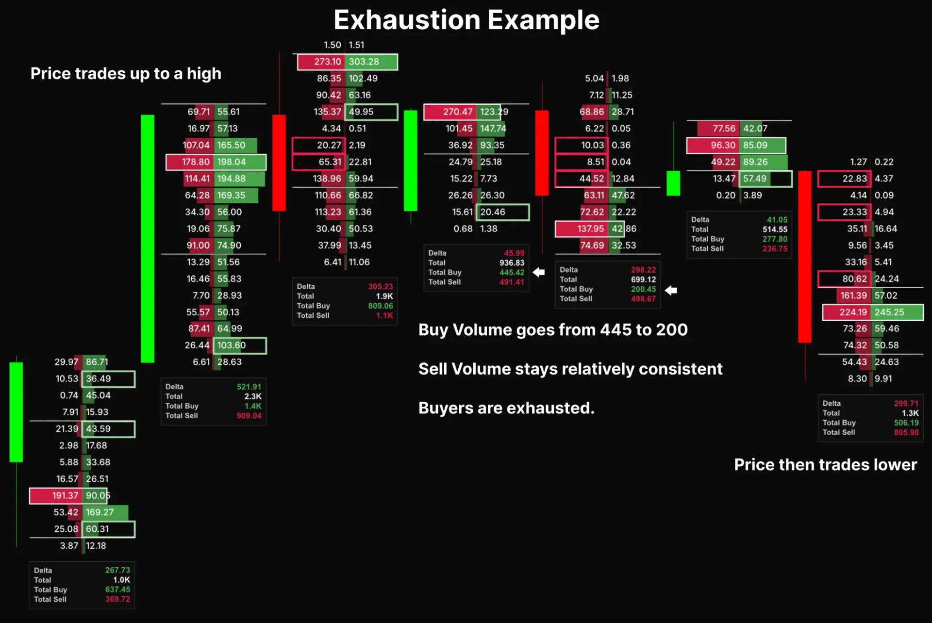
Exhaustion occurs when the volume remains high, but the buying or selling pressure weakens. This can indicate that the current trend is losing momentum and may be near its end.
Step-by-Step Breakdown:
Step 1: High Volume but Low Delta
The market sees high volume, but the delta (difference between buy and sell volume) starts to shrink. This indicates that both buyers and sellers are active, but neither side has control.
Step 2: Market Loses Momentum
Despite the high volume, price either stalls or starts to reverse. This suggests the market is exhausted, meaning the momentum behind the current move is fading.
For example: in an uptrend, buy volume starts to decline, while the sell volume increases slightly. However, price fails to move higher, and the trend begins to weaken, indicating potential exhaustion of buyers.
9.0 What are the Settings?
Unit (Coins or Dollars)
- This determines whether the footprint values are displayed in coins or dollar terms. Dollar mode can help compare volume across assets with different price ranges.
Display Mode
- Switches between the three footprint views, Split (or Bid/ Ask), Delta, or Total (Volume Profile).
Show Value
- Toggles whether the volume numbers appear inside each footprint cell. Turning it off can give you a cleaner chart, while keep it on can give you precise values. We recommend you keep this one on.
Value Area (%)
- This defines the percentage of total volume used to calculate the Value Area High (VAH) and Low (VAL). The default is 70%, adjust this depending on market volatility.
Ticks per Bar
- Controls how much price data is grouped into each footprint bar. Fewer ticks show more detail/ granularity, while higher values smooth out noise and show broader structure. Usually the lower the timeframe the lower tick size you should use.
Imbalances
- Skip Zero values: Ignore price levels with no traded volume.
- Imbalance Ratio: Sets the threshold for how much stronger one side’s volume must be compared to the other before making an imbalance (e.g. 10 = 10 times larger).
Show Decimals
- Adds decimal precision to volume values, useful when trading assets with small tick sizes.
Show Summary
- Displays key stats like Delta, Total Volume, Total Buy, and Total Sell for each candle. This helps quickly assess whether a move was driven by aggressive buying or selling pressure.
10.0 Finished Auction
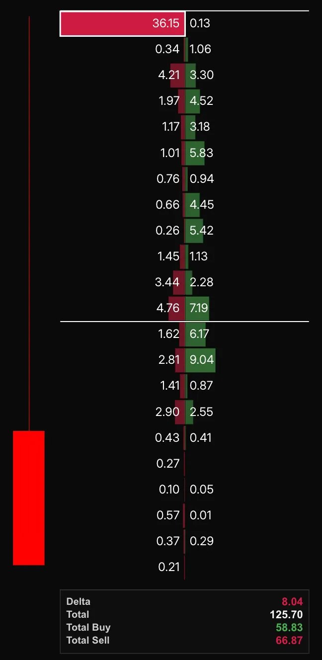
A finished auction occurs when the price reaches an extreme level where there are no longer buyers at the high (finished buying auction) or no sellers at the low (finished selling auction). This creates a liquidity void, where the market looks for new participants to drive the price in the opposite direction.
Step-by-Step Breakdown:
Step 1: Lack of Orders at Extreme Prices
- When price reaches a high point and there are no buyers willing to continue buying (finished buying auction), or when price reaches a low point with no sellers left to push the price lower (finished selling auction), the market becomes “stuck.”
Step 2: Liquidity Search
- After the market exhausts the available orders at the extreme, the price must "search for liquidity." In other words, it needs to find new buyers (after a finished buying auction) or new sellers (after a finished selling auction) to continue moving in the direction of the current trend or reverse.
Step 3: Price Reversal or Consolidation
- This search for liquidity usually leads to price either consolidating near the extreme level (if no new orders appear) or reversing direction sharply as new participants enter the market. If the market was previously trending up and runs out of buyers, price may drop. If the market was trending down and runs out of sellers, price may rise.
A finished buying auction forms when aggressive buyers stop lifting offers near the high, shown by minimal ask volume at the top of the footprint. This signals that there are no longer buyers willing to pay higher prices, often leading to a short-term pullback or reversal.
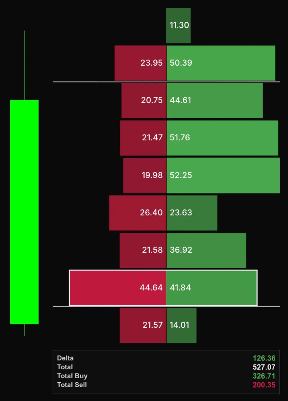
Similarly, a finished selling auction forms when sellers stop hitting bids near the low, shown by minimal bid volume. This indicates selling pressure has dried up, and price may begin moving upward as the market searches for liquidity.
11.0 Timeframe
Footprint charts are most commonly used on lower timeframes for scalping and short-term trading. This is because they provide detailed, granular insights into order flow and market activity, which is most useful for quick decision-making.
On higher timeframes, such as the 4-hour or daily charts, footprint charts become less effective. The amount of volume and order flow detail available on these timeframes is limited, making it harder to spot precise imbalances, absorption, and other subtle market dynamics. As a result, footprint charts are usually not used on timeframes higher than the 1-hour chart for effective analysis.
12.0 Aggregated Footprints
Aggregated footprints are useful, but they’re not the most important thing if you don’t know what you’re looking for. The first step is to focus on the chart from the exchange you trade on. For example, if you trade BTC on Binance, you’ll want to use BINANCE.F|BTCUSDT, and for Bybit, it’s BYBIT.F|BTCUSDT.
Once you have your exchange chart, aggregated footprints come into play when you want to get a broader view of the market. They combine data from multiple exchanges, giving you a larger perspective on overall market volume and activity. This can help you spot big-picture trends or general market sentiment. However, using aggregated footprints can obscure finer details, especially when you're trying to spot specific price actions or imbalances on individual exchanges.
Key Considerations:
- Exchange-Specific Details: The activity on your exchange might look different than what’s happening across all exchanges. When aggregating, you lose those specific market behaviors—such as a sudden imbalance or price change on a particular exchange—that can provide valuable trading insights.
- Aggregated Data Can Smooth Out Noise: Aggregation averages out data, so subtle price shifts or small imbalances that matter for scalping or short-term trading can get diluted. For example, a large buy imbalance on Binance may not show up in an aggregated footprint if other exchanges have less volume or opposing activity.
When to Use Aggregated Footprints:
- Broader Market Trends: Aggregated footprints are more useful when analyzing larger, liquid markets, where looking at total market volume across exchanges helps confirm a broader trend.
- Market Sentiment: If you’re trying to gauge general market sentiment or overall participation across exchanges, aggregation can help you get a clearer picture of the larger market structure.
When Not to Use Aggregated Footprints:
- Exchange-Specific Insights: If you need detailed information about a specific exchange (e.g., Binance or Bybit), aggregation can blur the nuances that help make precise trading decisions.
- Low-Liquidity or Smaller Markets: In markets with less volume, aggregation can mask important signals from specific exchanges, making it harder to spot real opportunities.
In short, start with the chart from your primary exchange for accurate, exchange-specific analysis. Use aggregated footprints for a broader market view, but always be aware that important details might get lost in the process.
13.0 Contextual Use with Other Tools
Footprint charts become far more powerful when combined with complementary tools that provide context and confirmation. Each tool reveals a different layer of market behavior, and together they create a complete view of liquidity, intent, and structure.
13.1 Orderbook Heatmaps
Heatmaps display resting limit orders waiting to be filled, while footprint charts show executed trades. Using them together helps distinguish between visible liquidity (orders in the book) and actual participation (orders executed).
- A footprint showing heavy buying at a price where the heatmap shows a thick sell wall can indicate absorption.
- If both the footprint and heatmap show buyers aggressively lifting offers and walls shifting upward, it suggests momentum continuation.
13.2 Volume Profiles and VWAP
Volume profiles and VWAP identify the areas of fair value and imbalance on higher timeframes. Footprints refine that view by showing how trades occur within those zones.
If the footprint shows stacked buying imbalances near VWAP or a high-volume node, it reinforces the idea of strong demand.
Conversely, a cluster of selling imbalances below VWAP can confirm a shift in control to sellers.
Using both allows you to anchor micro-level execution data (footprints) within macro-level context (VWAP and volume distributions).
13.3 Market Structure
Market structure defines the broader trend, while the footprint reveals intraday behavior within it.
In an uptrend, focus on absorption at lows or bullish deltas confirming higher lows.
In a downtrend, watch for failed buying attempts and strong negative delta near lower highs.
Footprints without context from structure can mislead, since even strong imbalances are often just retracements in a larger trend.
14.0 Common Mistakes When Reading Footprints
Footprint charts offer deep insight, but misreading them can lead to false conclusions. Below are common pitfalls that often cause traders to misinterpret the data.
14.1 Overreacting to Single-Candle Imbalances
A strong imbalance or delta spike in one candle doesn’t always signal continuation or reversal. Many traders mistake isolated aggression for trend confirmation. Always confirm whether the move is supported by sustained participation across several candles or if it’s just a short burst of activity.
14.2 Ignoring Higher-Timeframe Context
Footprints show micro-level execution, not the overall trend. An imbalance at a swing high in a strong uptrend can mean exhaustion, but the same signal during consolidation may mean nothing. Align footprint signals with other tools before acting.
14.3 Misinterpreting Absorption
Absorption is often confused with weakness. Heavy sell volume absorbed at the lows doesn’t always mean further selling, it can signal strong passive buying. Distinguish between aggressive and passive participants by watching whether price actually moves with or against the heavy volume.
14.4 Ignoring Liquidity Conditions
During low-liquidity periods, such as session opens or late hours, delta and imbalance data can distort easily. Small orders can create exaggerated readings. Always note the time of day and market session before trusting footprint signals.
14.5 Treating Aggregated Data as Precision Data
Aggregated footprints smooth out details. Using them for scalping or precise entries can lead to missed signals or false assumptions. Always rely on exchange-specific data for execution and aggregated data for broad sentiment.