Market Profile Series #1
One of the tools that gave me and many others the biggest edge is indeed the market profile.
To make sure everyone is on the same page, I will provide the simple basic knowledge to learn how to read a market profile, so you can practice and get comfortable with it before we delve into more complex stuff.
1. The normal distribution
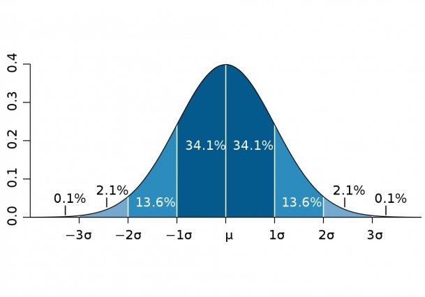
A bell curve chart.
A normal distribution is a bell-shaped curve that shows how data points are spread out, with most values clustering around the mean (the peak) and symmetrically tapering off into tails on both sides. In market profile trading, it helps us understand how prices are distributed during a session, highlighting areas of balance (where most trading happens) versus imbalance (extremes). This visualization makes it easier to spot fair value zones and potential breakout points. Standard deviation is a measure of how much the data varies from the mean—roughly 68% of the data falls within one standard deviation on either side, which directly ties into concepts like the value area we'll cover later.
2. The Time-price opportunity footprint (TPO)
In TPO charts, each TPO (e.g., a letter like A, B, C) represents a unit of time (like 30 minutes) where the market traded at a specific price level.
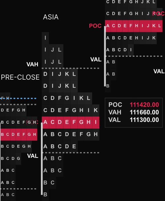
If you rotate the image, you can see the resemblance to the bell curve.
Referring to it as footprint is the key to understanding how it works.
During period A (first 30 minutes of trade), price went from 110,900 to 110,700, during period B (from minute 30 to minute 60), price moved from 110,600 to 110,500, before returning to the opening price 110,900, and so on. You follow the footprints of the path taken by price.
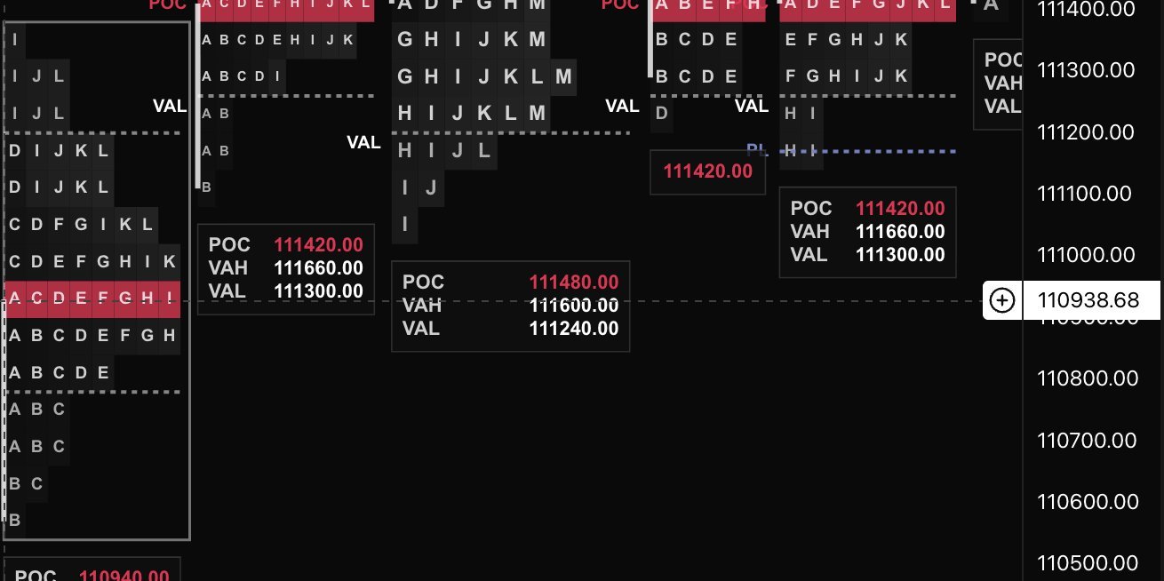
3. X and Y axis, and the profile.
First, we need to recall how candlestick charts work, and then forget about them for a moment.
Generally, the X and Y axes on a chart correspond, respectively, to time and price.
In TPO, things work a little differently. While the Y axis still refers to price, it also refers to time. Every TPO profile is one session, be it a day, a market session, or an hour. Open and close markers can be found on the Y axis, too.
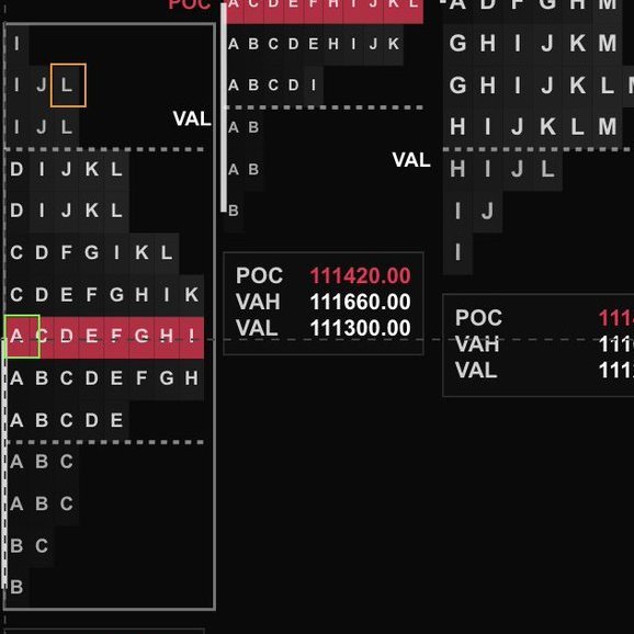
Open and close are highlighted in green and orange color, respectively.
Notice how the central levels of the range have more footprints, representing the price trading through certain points more often.
The X axis indicates the frequency of trading at a certain price during a given time frame.
The more footprints on the X axis, the higher the amount of trades. When the price revisits a certain level at a different time, another footprint (letter) will be added at the price level.
For the sake of simplicity, let's not consider tick size at this time.
All my articles and education material is free and always will be. I make enough by trading, and I'd rather you use your money to enjoy life, whatever that means to you.
4. The Value Area (VA)
As I wrote about the bell curve, I mentioned standard deviation.
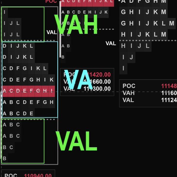
Well, the value area is just that, +/-1 standard deviation from the mean. The size of the VA is normally set at 70%
Anything above is defined as Value Area High (VAH) (value normally set at 15%) and Value Area Low (VAL) (value normally set at 15%).
VA is highlighted in blue, and VAH/VAL are highlighted in green.
5. The Point of Control (POC)
The point of control is the point where the most trading activity took place. In bell curve terms, the mean.
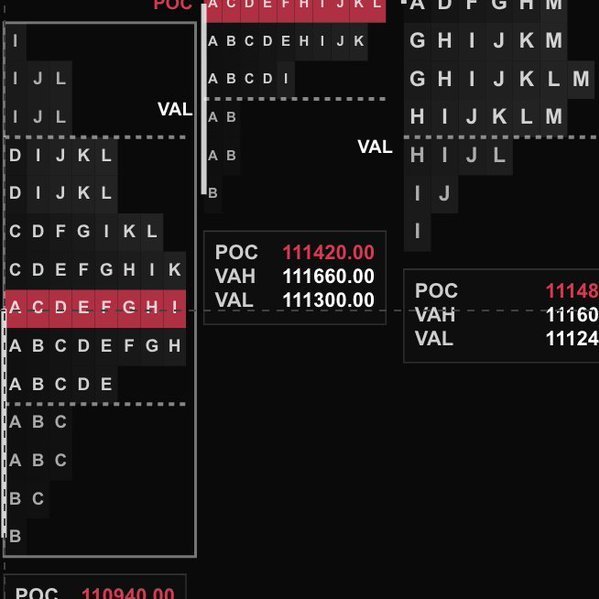
POC highlighted in red, both in price and as a band in the profile.
The POC often acts as a magnet for price, serving as potential support or resistance in future sessions. It's where the market found the fairest price based on volume, so traders watch it closely for rotations or breakouts.
6. The Initial Balance (IB)
The initial balance is the price range of the first 2 periods (generally, 2x30 minute periods for a total of 1 hour).
Here IB is highlighted as a white vertical band in the left side of the profile. It refers to the range of A and B periods.
This initial range sets the tone for the session, showing early conviction from buyers or sellers. A wide initial balance might indicate volatility ahead, while a narrow one suggests consolidation. It's a key reference for gauging intraday direction.
7. Single prints
Single prints are price levels in the profile where only one TPO (or a single letter) appears, meaning the market moved through that area quickly without much revisiting. They often highlight areas of imbalance, like rapid buying or selling pressure, and can act as future support or resistance zones when price returns.
Single prints are highlighted in purple color.
8. Poor highs, poor lows
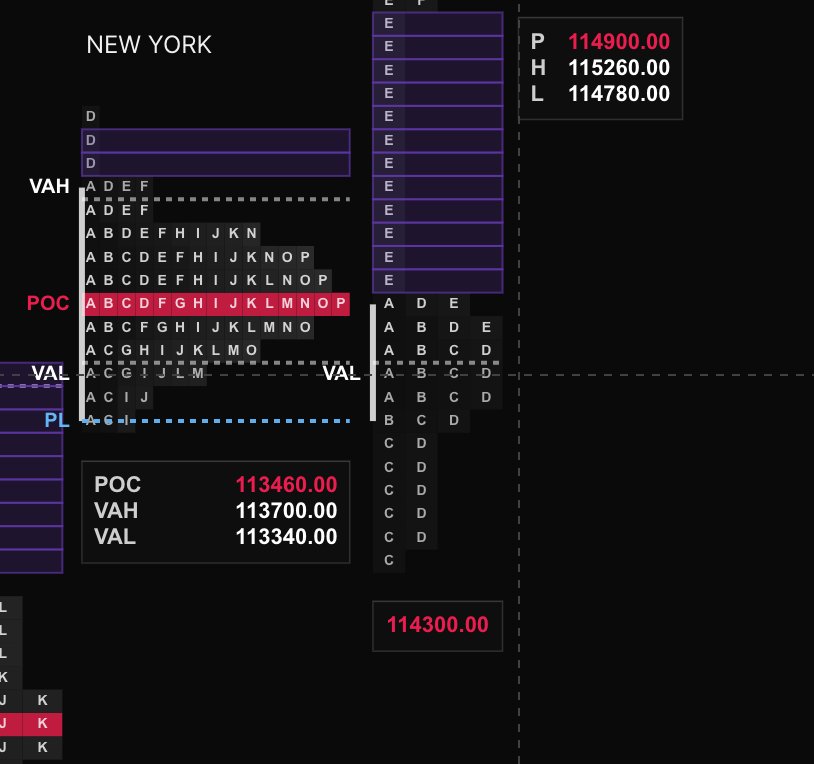
Poor highs and poor lows refer to the top or bottom of a profile where the structure tapers off without forming a tail, lacking a thick buildup of activity. This suggests weak conviction from buyers (at highs) or sellers (at lows), often signaling potential reversals or failed breakouts, as the market didn't accept those extremes.
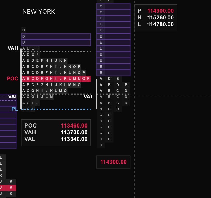
A poor low on the NY session. Notice how the poor low was taken out in the following session?
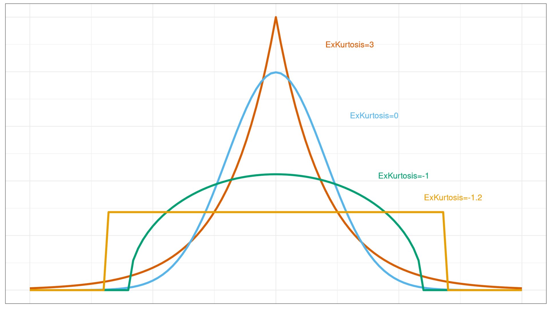
9. Kurtosis, and the idea of tails.
Kurtosis measures the "tailedness" of the distribution in a market profile: high kurtosis means fatter tails with more extreme price moves and a sharper peak, indicating volatile or trending sessions, while low kurtosis shows thinner tails and a flatter profile, suggesting balanced, range-bound trading. Tails in the profile represent those outlier areas where price extended but didn't stay, often revealing rejection points.
10. Buying tails and selling tails
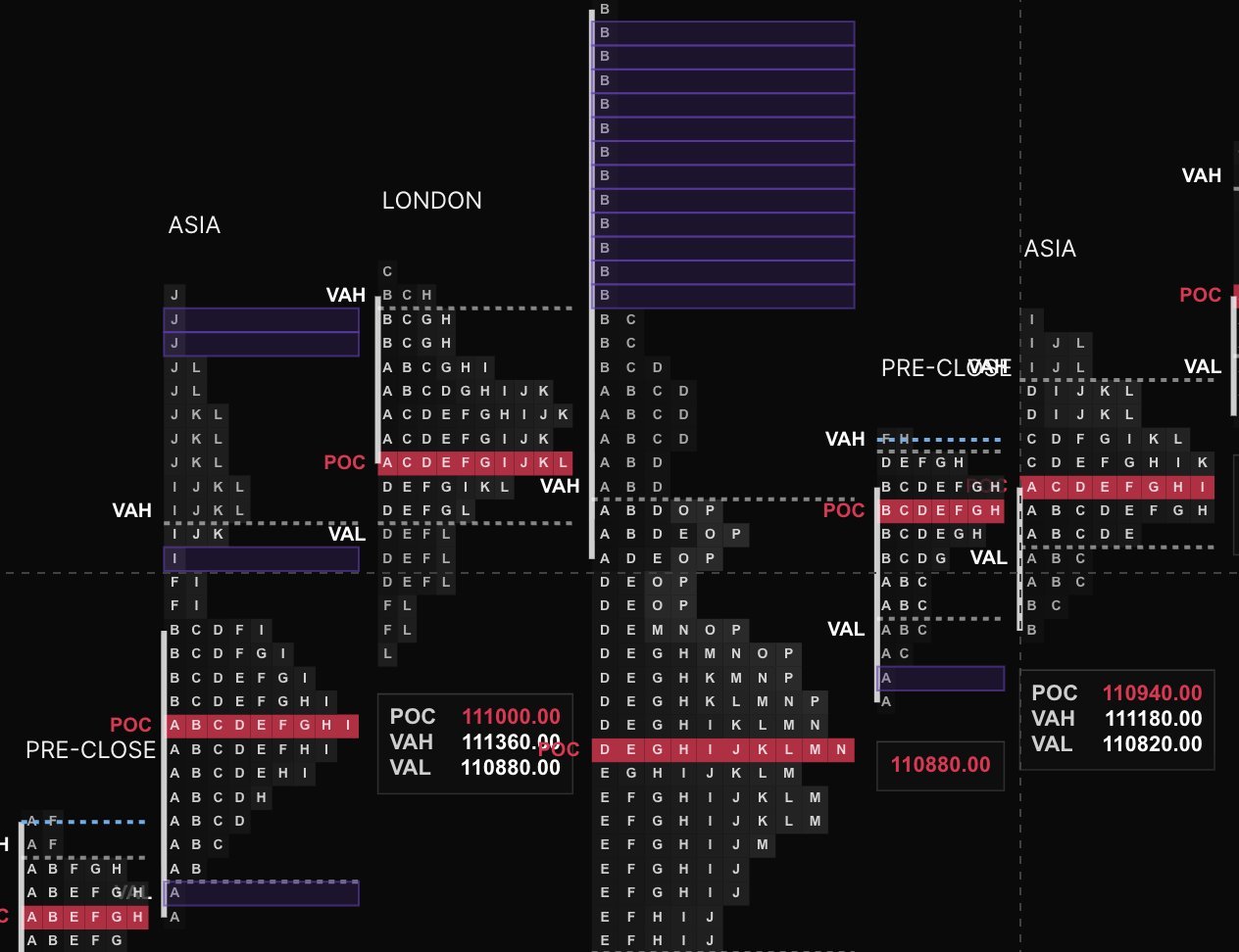
Buying tails and selling tails are the single-print extensions at the bottom (buying) or top (selling) of the profile. A buying tail shows aggressive buyers stepping in at lows to reject lower prices, often signaling a potential reversal upward. Conversely, a selling tail at the highs indicates sellers overwhelming buyers, pushing prices down and hinting at bearish continuation.
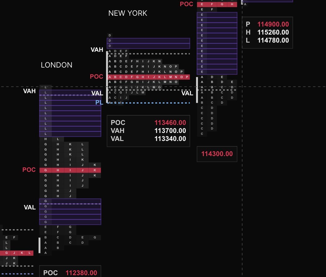
Notice the selling tail in the London session? The selling was very aggressive and created an imbalance. It later formed a poor low (giving use further confirmation), and the following session revisited the selling tail level.
11. Acronyms
Here you will find a list of acronyms that are commonly used in market profile commentaries. I urge you to memorize them because for the sake of narration I won't explain them in the future.
From this article: TPO (Time Price Opportunity), POC (Point of Control), VAH (Value Area High), VAL (Value Area Low).
Other common ones:
- VA (Value Area),
- pdLow/High aka pdH/pdL (previous day low/high),
- IB (Initial Balance, aka Opening Balance),
- HVN (High Volume Node),
- LVN (Low Volume Node),
- ONH (Overnight High),
- ONL (Overnight Low),
- VPOC (Volume Point of Control),
- Naked POC (Unresolved POC from prior sessions).
By the way, all the screenshots are from Kiyotaka. It's a good, free TPO charting web app. Their indicators are top notch, and team delivers updates on a daily basis.
Until next time